Case study
Revolutionising how creators and fans interact through 1:1 paid calls
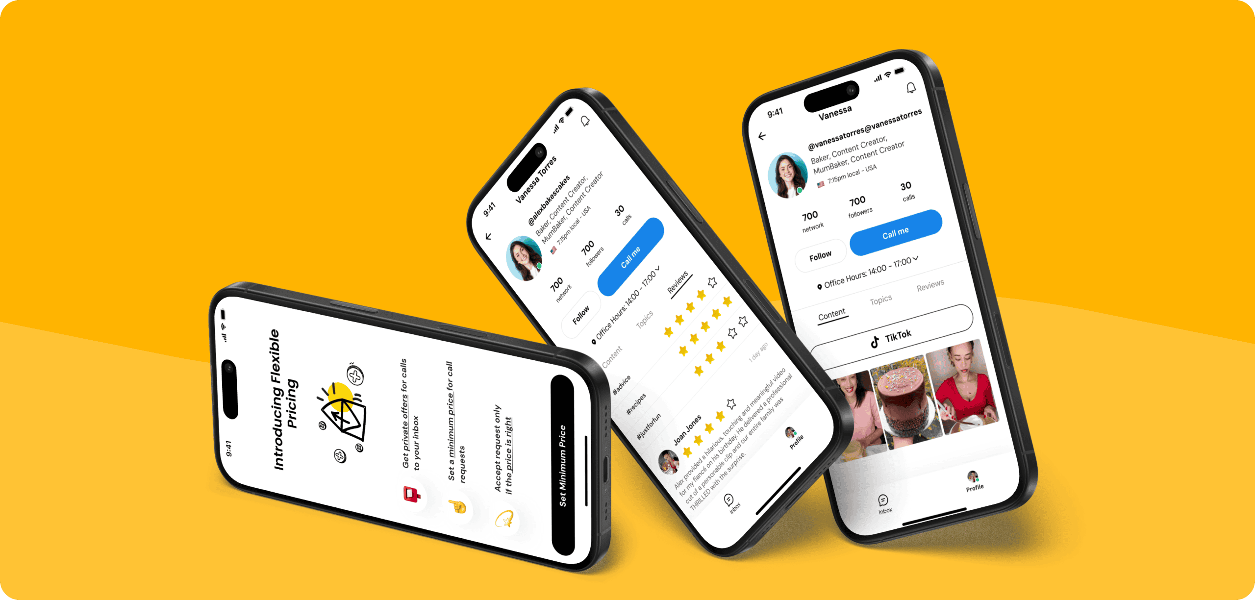
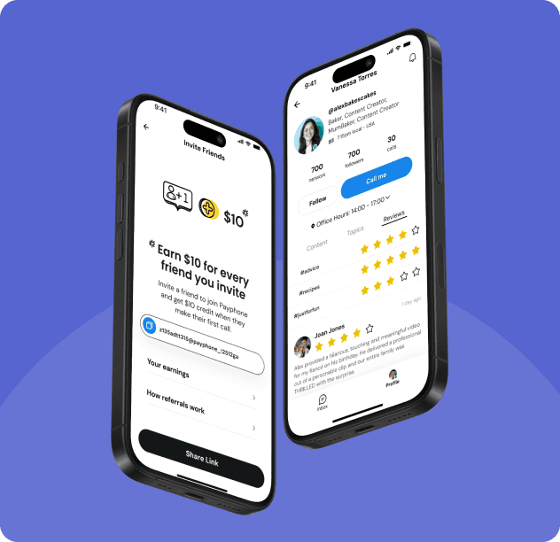
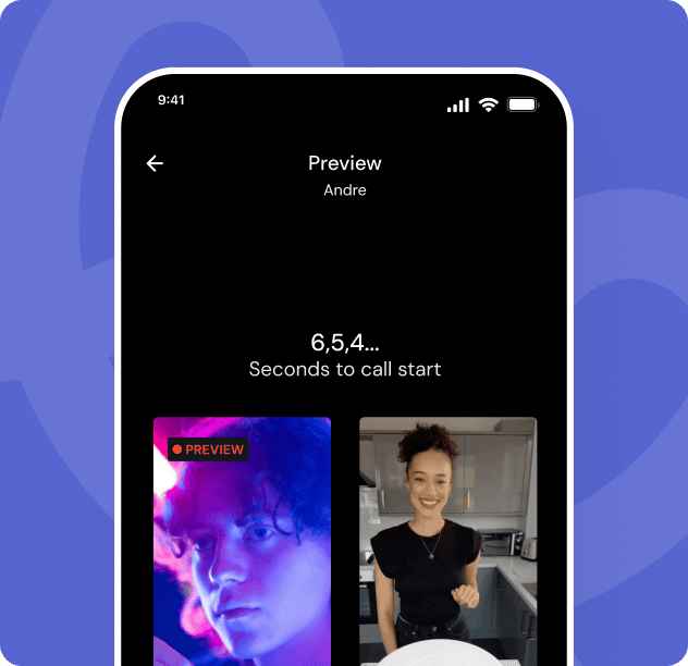
PayPhone is an app that allows people to request 1:1 paid calls with you. Share your link with your audience, accept call requests to answer questions, give feedback, or just chat, and get paid.


UX/UI was prohibiting growth
Having worked with numerous designers previously, PayPhone still hadn’t managed to achieve the level of quality of UX and visuals to be competitive. They needed to work with a design team that could move fast, design new features quickly and set the product ahead of the curve. Being relatively new, much of the concept was loosely defined and needed solidifying, such as understanding the user and competitive landscape.
Creating an experience based on real-world user data.
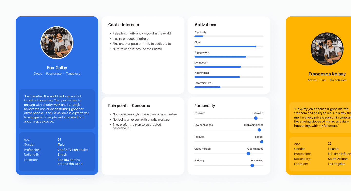
Prior to beginning work, we were given access to five previously designed user personas.
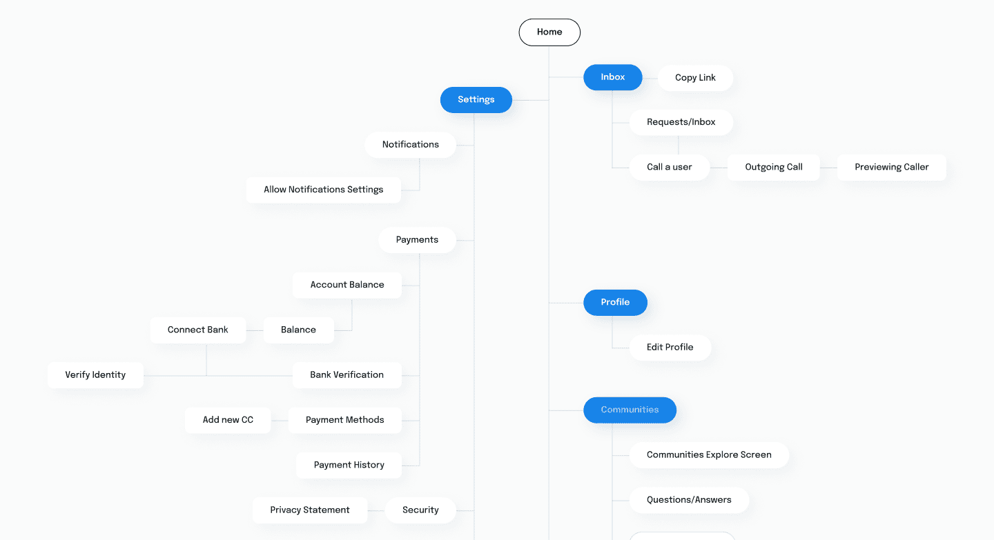
Using these personas as our ideal customer profiles, we defined all the primary journeys in the app. This enabled us to identify users’ pain points and emotions at each step in the journey.
Identified the key user personas and understood their motivations in detail to give us an accurate indication of who to design for
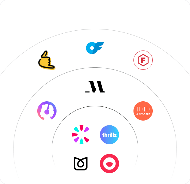
Solace estimated a persona match score (%) for celebrities, established creators and fans.
To speed up future iterations we built an enterprise-standard design system for PayPhone, with all components and styles systemised
This was then rolled out throughout the application and a written guide was produced to instruct future designers.
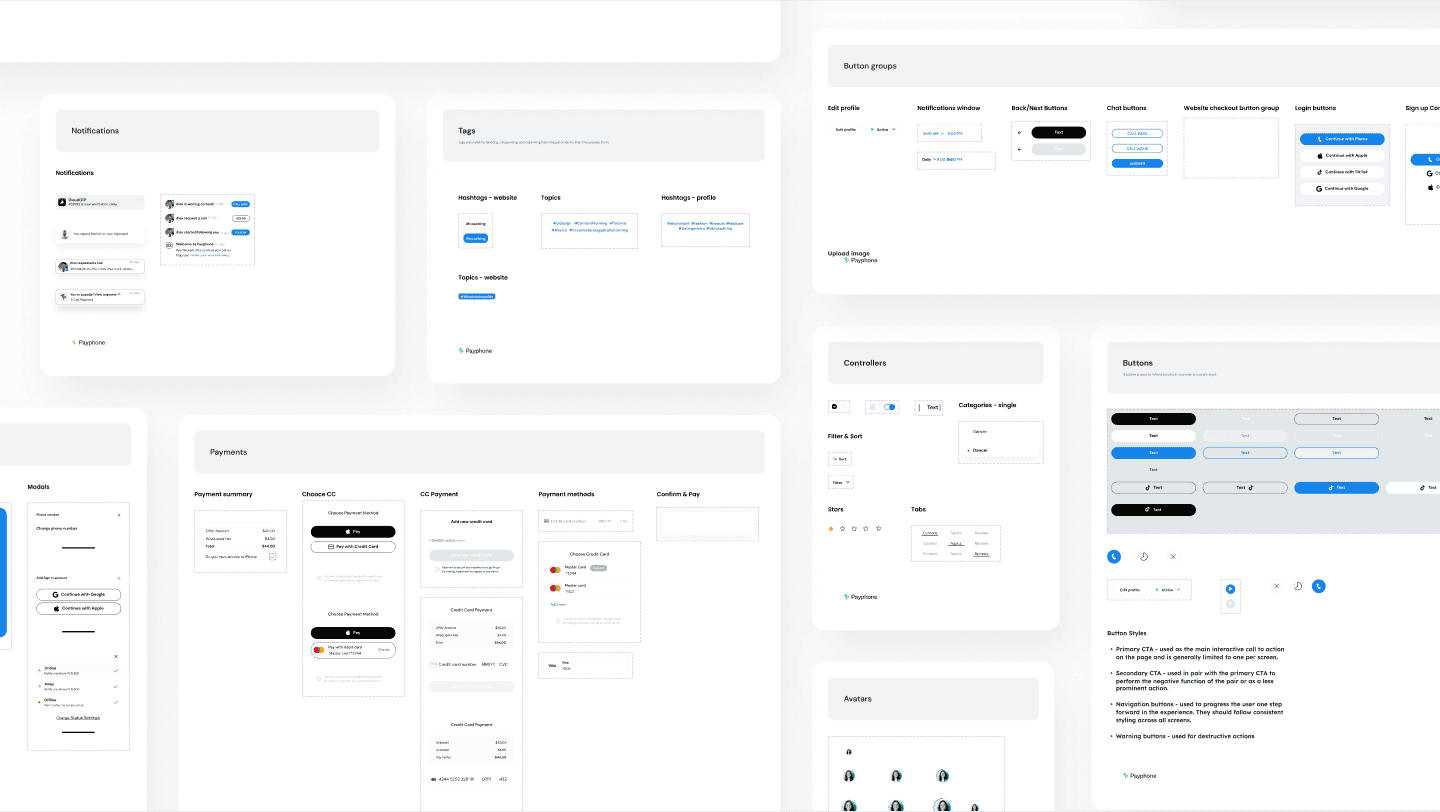
A new visual language was established to be bright and empower fans to take action and speak with creators.
PayPhone went through three name changes (Holler, Wisellama then PayPhone!) We rebranded to support the new commercial positioning and enable the brand to appeal to a mass-market.
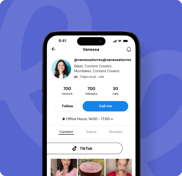
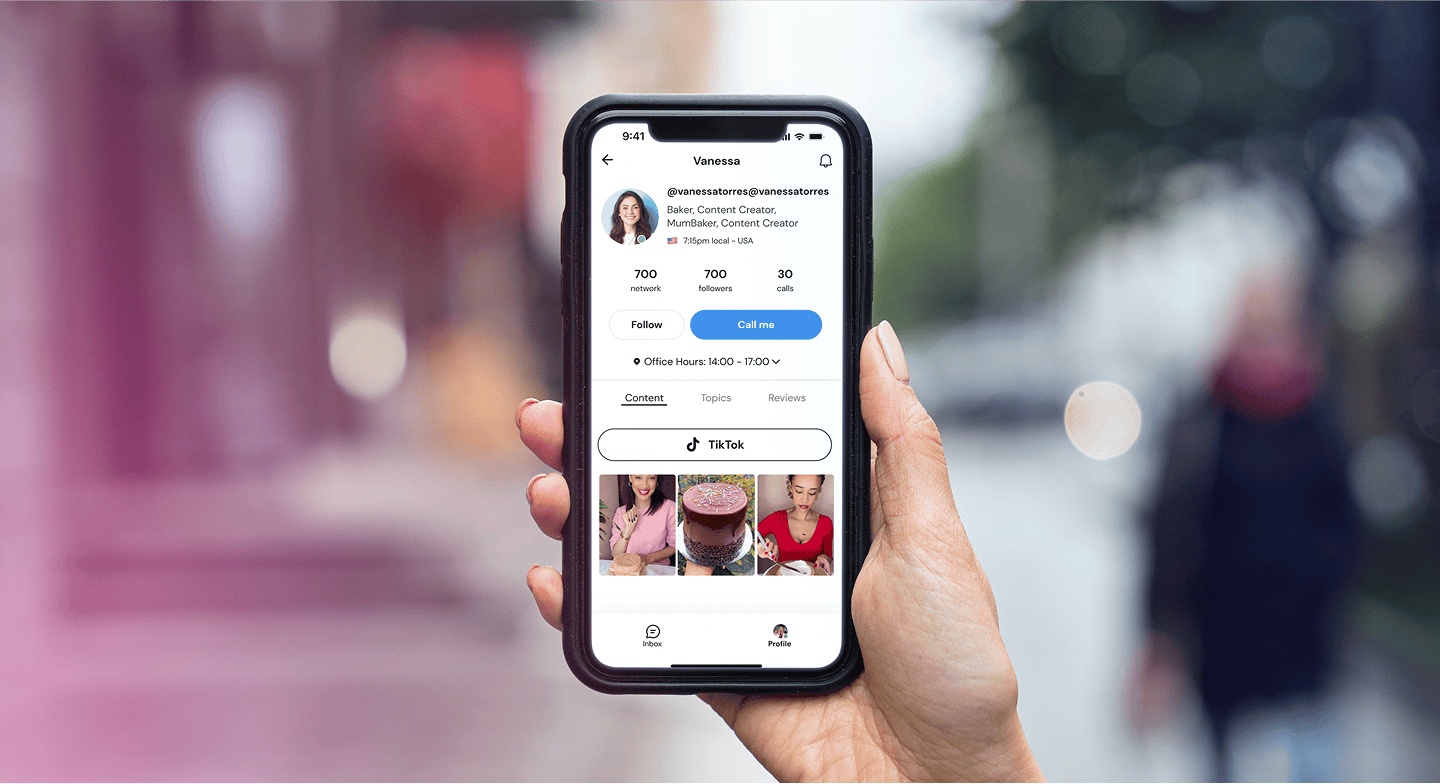
A Modern and Engaging Mobile Experience
Our visual design approach focused on creating a sleek, intuitive, and highly engaging mobile interface that enhances the user experience. Every screen was carefully designed to ensure clarity, accessibility, and seamless interactions, making it effortless for users to connect, engage, and navigate through the platform.
PayPhone is live on the app store and currently building traction.
The end result is a user experience aligned with the market, cutting-edge visuals and a strong design to move the business forwards. They are currently fundraising, leveraging the work from the Solace team and intent to scale exponentially in the near future.