Case study
Delivering a new digital presence for an Antler backed SaaS FinTech startup
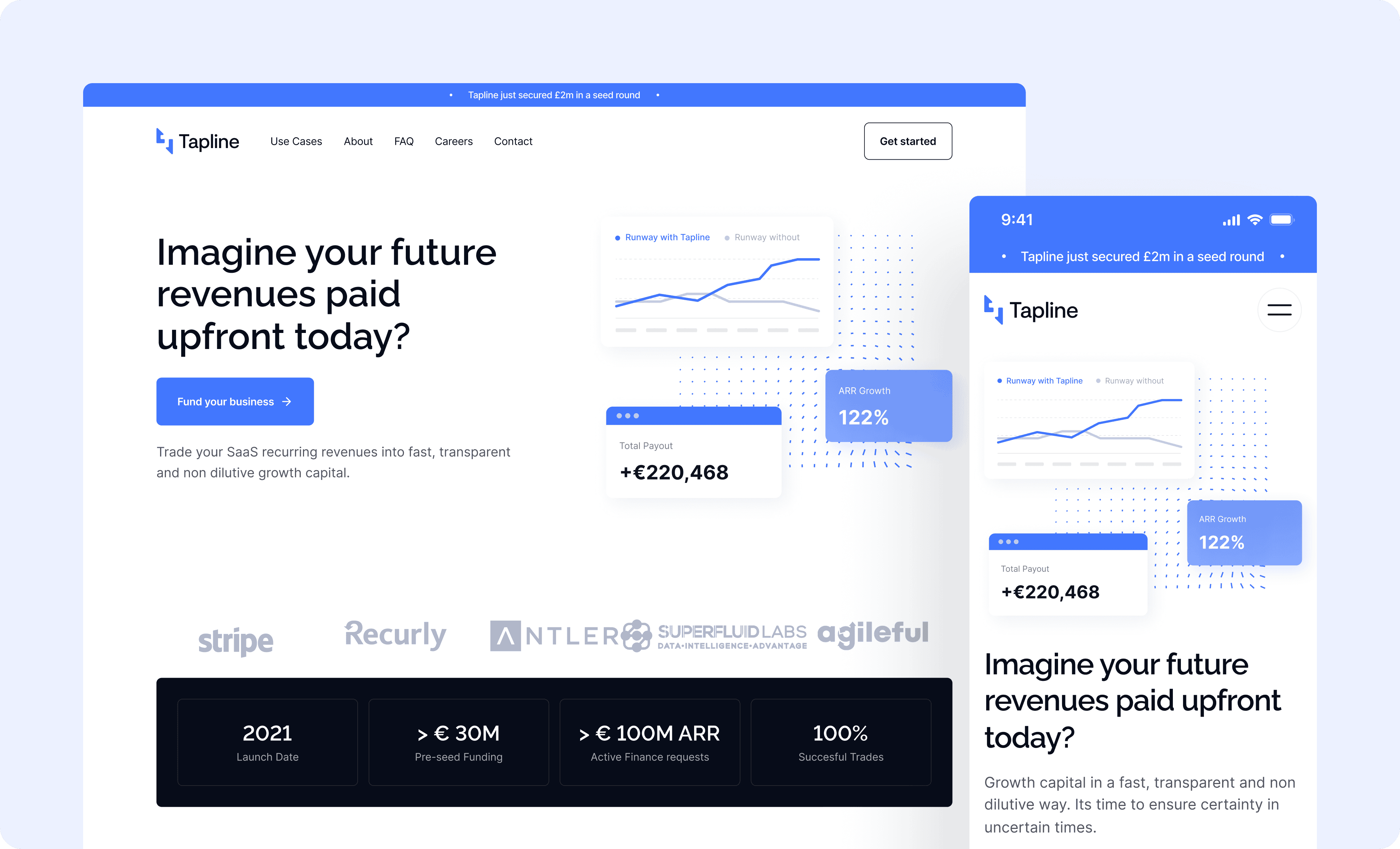
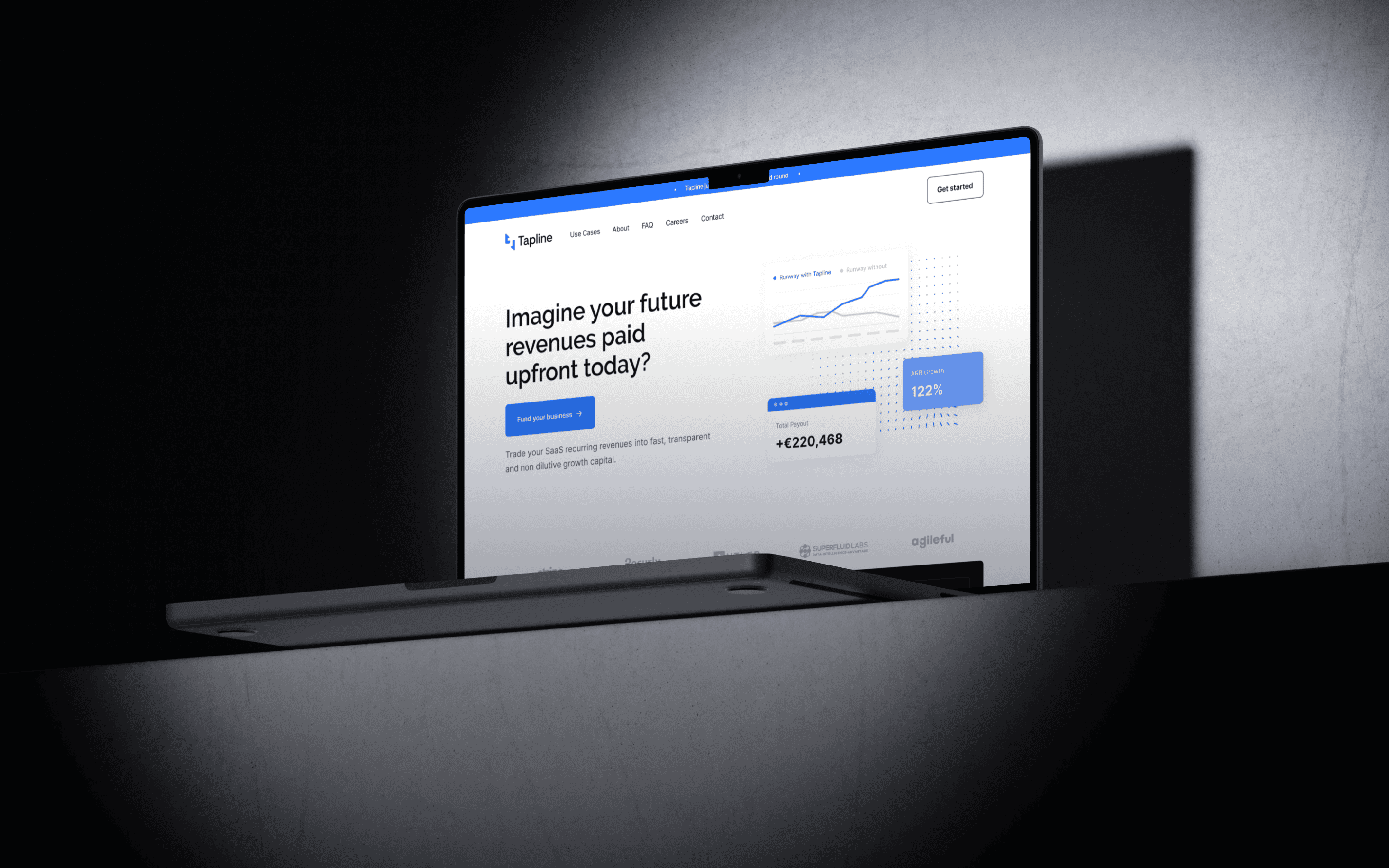
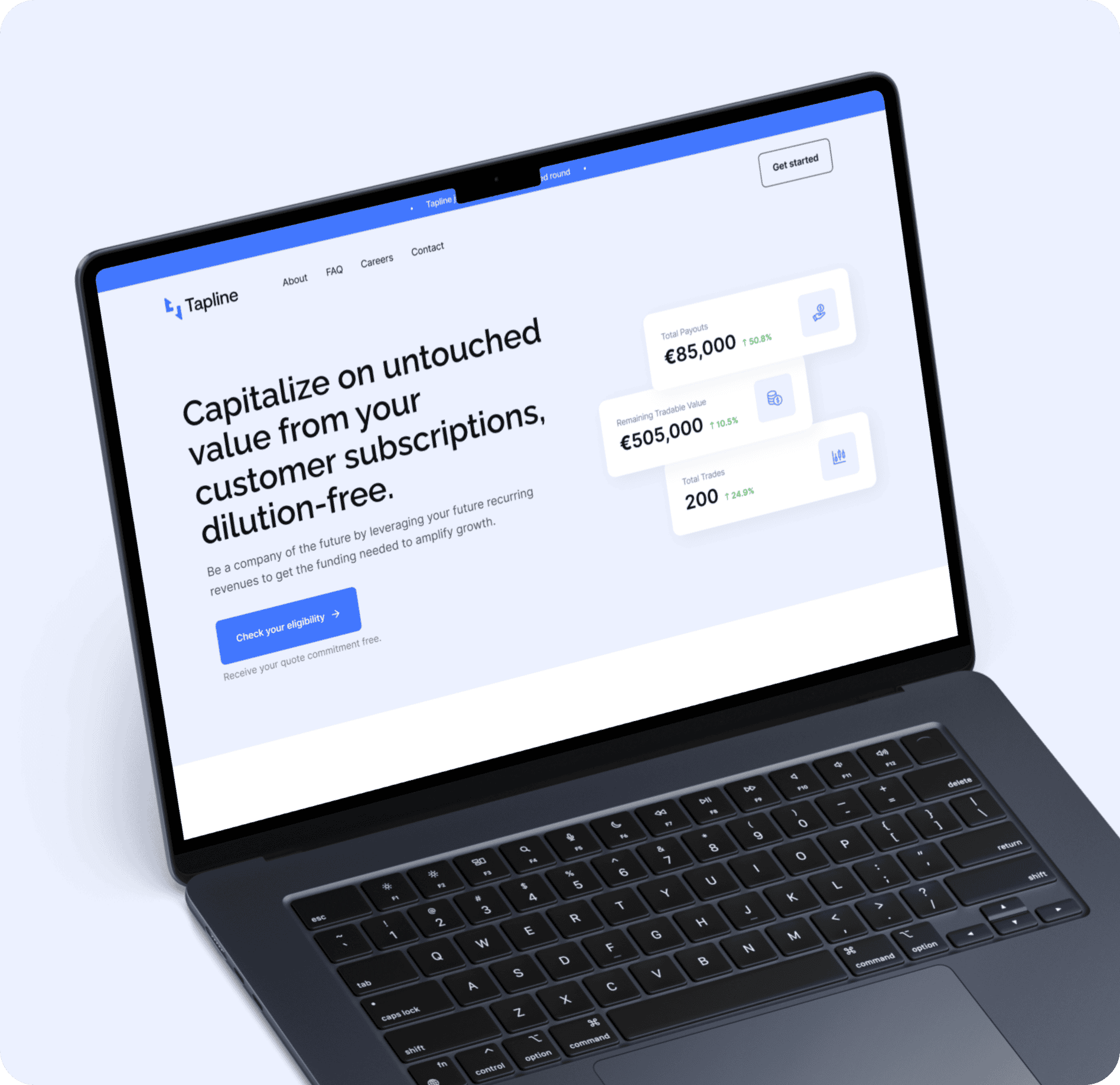
Tapline is the SaaS funding platform that transforms subscriptions into upfront cash. The product challenges traditional funding with no dilution and instant access to capital. Get 60% of your annual recurring revenue upfront today.


Dean Hastie,
Co-founder & CEO at Tapline
Having recently closed their pre-seed round, the Tapline team needed to elevate their corporate image to meet customer and investor expectations.
The previous brand identity was dated, and they needed to be more competitive in the market. Additionally, the messaging was incoherent, and customers found it challenging to understand Tapline’s offering and the value added for SaaS businesses. Complementary to messaging, the structure and visuals of the website needed to be taken to the next level to meet growth targets.

We worked alongside Tapline with an agile approach to deliver a new digital presence helping them to get to the next phase.

We started at the core of the business model with an in-depth discovery process to understand the competitive landscape, brand values and core offering.
Key competitors such as Capchase and Pipe are leaders in the field. Therefore, we devised a unique visual language to differentiate Tapline. We devised three creative routes for the brand each based on the brand strategy to explore the creative potential.

Collectively, we decided on a single creative route to refine and convert into a cohesive brand identity.
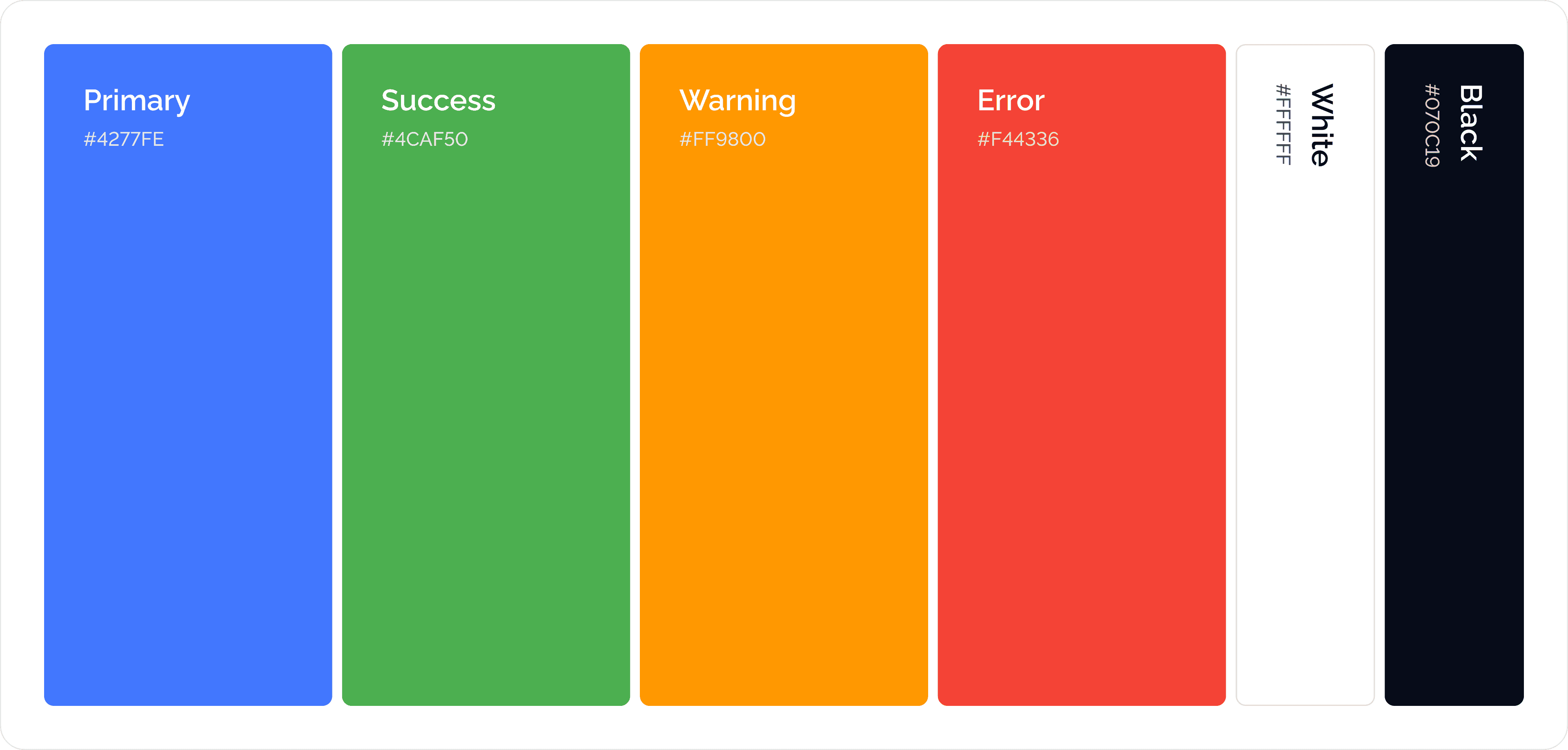
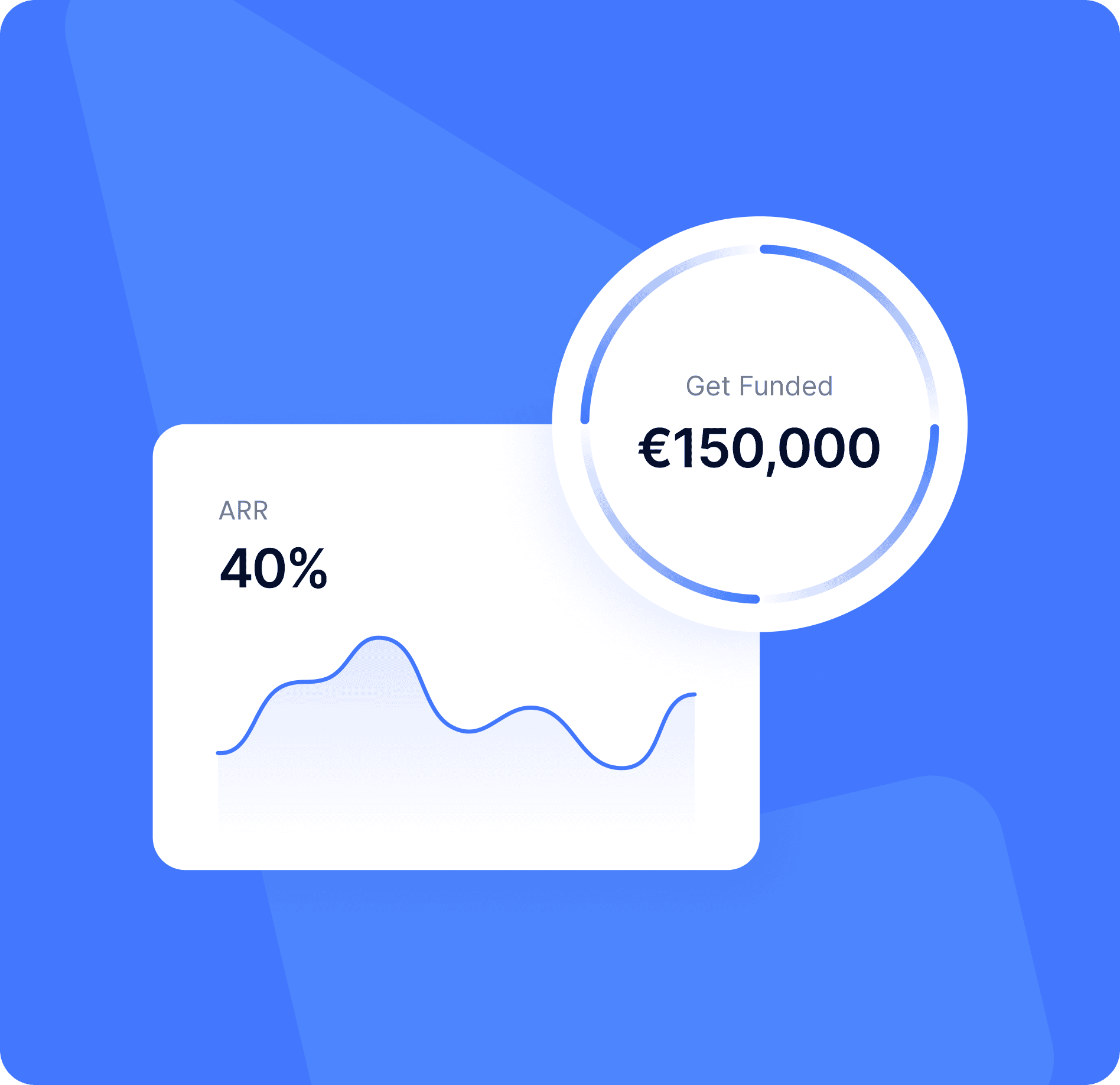
The icon mark depicts a dynamic finance market with the arrows indicating growth. We chose blue to convey trust as an investment solution.
To visually depict Tapline as a new disruptive concept, we introduced vector illustrations outlining key concepts such as revenue, runway and financial forecasts.
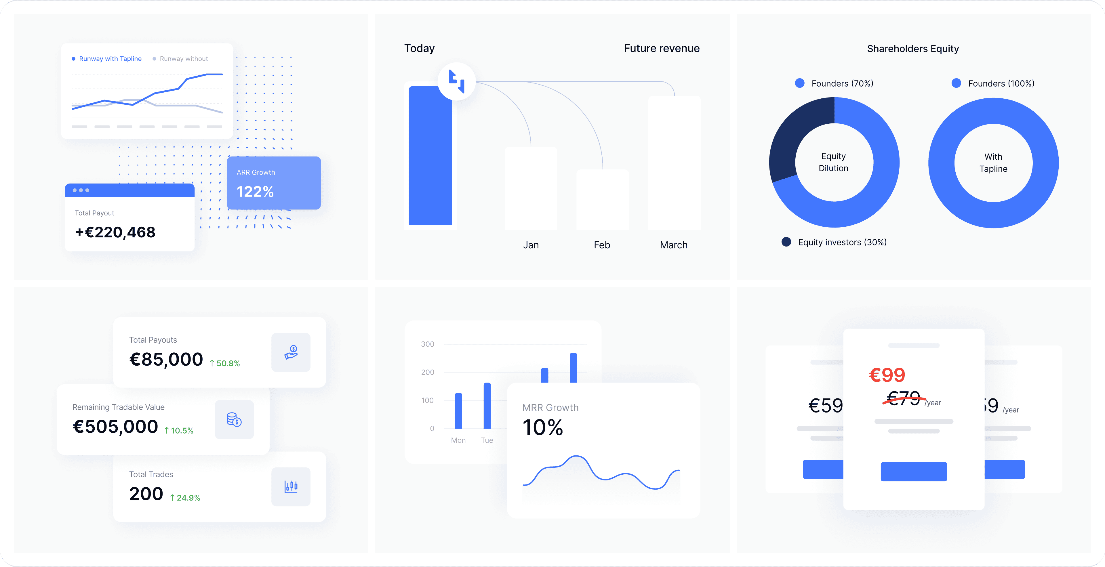
We structured the designs to sell their solution in the best light, convert more customers to paid acquisitions and elevate Tapline’s brand image.
The visual design was executed after the UX phase, with a colour scheme that differentiates in the market and positions as an innovative funding platform to disrupt FinTech.
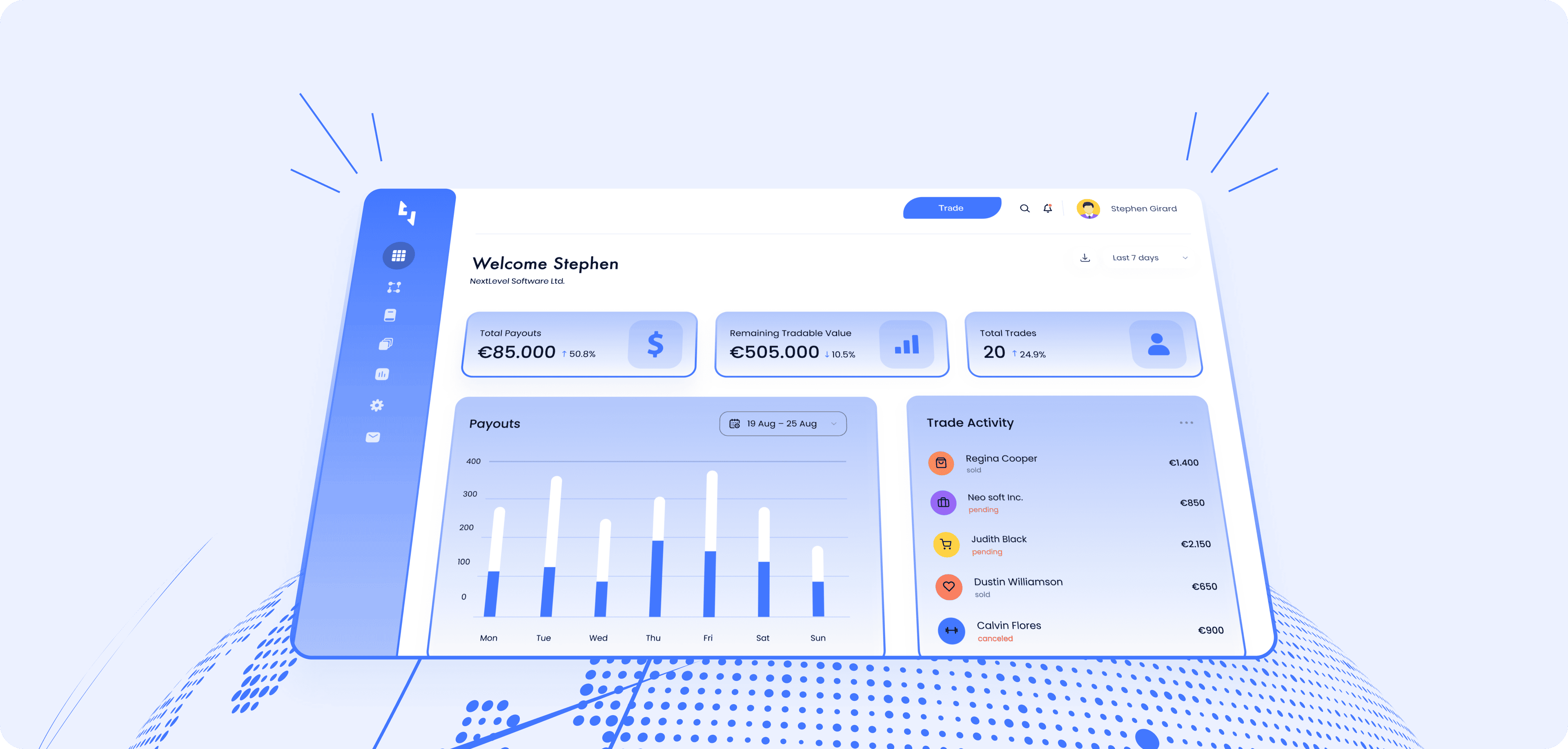
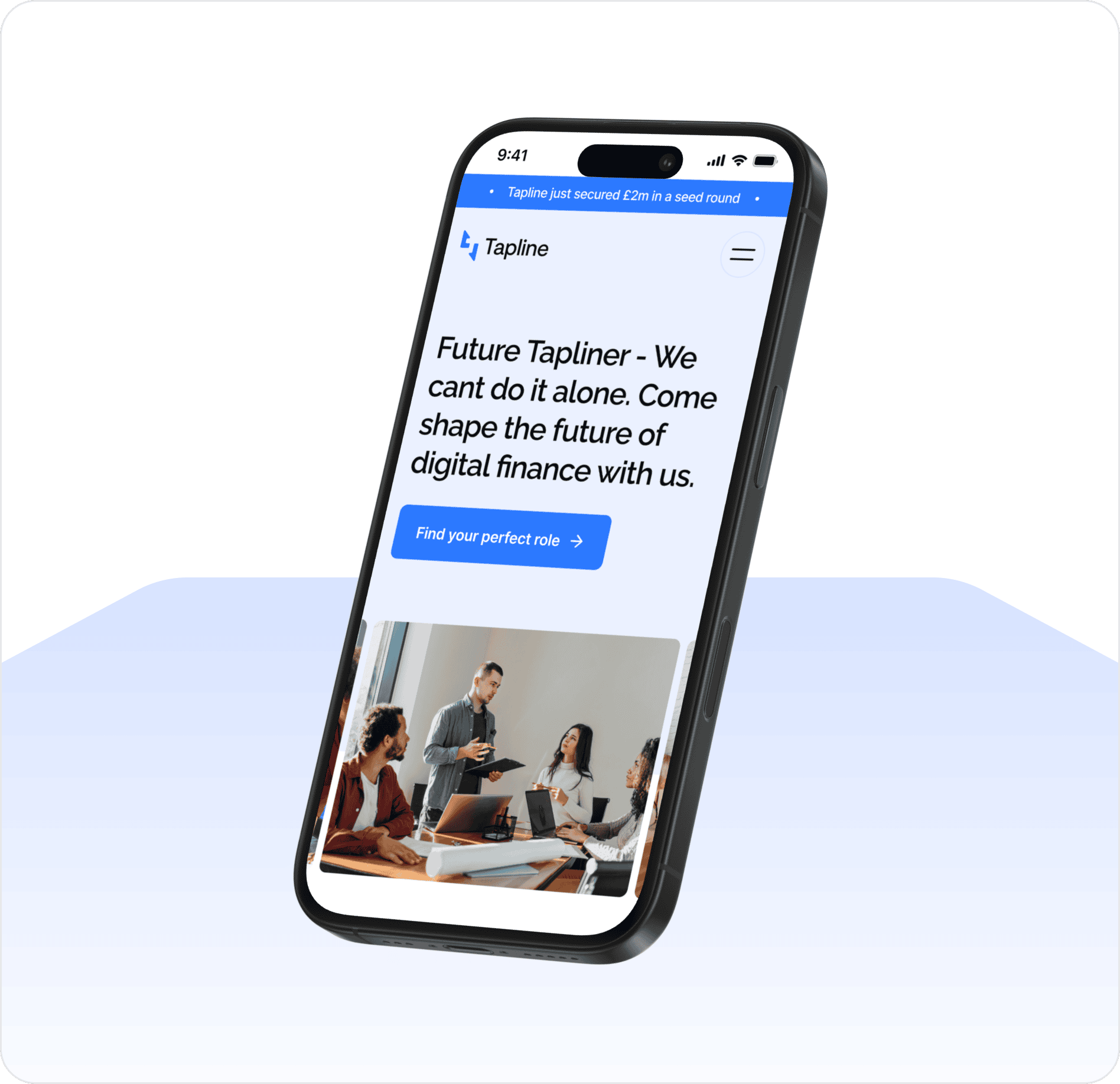
Optimizing User Flow and Interactive Financial Insights
After establishing a strong visual identity, we focused on refining the user experience and interactive financial tools to ensure a seamless, engaging, and intuitive platform for Tapline.

After the process, Tapline had a much improved digital presence, which resulted in a clear visitor understanding of the solution and the ability to raise the next investment round.
We set the critical foundations for Tapline to reach the next phase with laser-focused messaging, a clear information architecture and visuals that showcase the solution in its best light. Feedback from the founding team suggested hiring new team members has improved, with more confidence in the trajectory and value proposition.