Case study
Wealth analytics platform for high net-worth individuals
Strabo is a wealth management platform that empowers individuals to aggregate their financial assets for better visibility of their total net worth. As a fully customisable investment dashboard users can see the status of their assets alll around the world.
Having recently closed a £240k crowdfunding round, Strabo had a mission to work towards product-market fit and build an interface that encourages people to integrate their sensitive financial assets.
The existing interface did not build customer confidence, looked unpolished and wasn’t at the proper standard for a post-beta launch. Additionally, user retention and engagement were a concern as key habit loops were yet to be established.

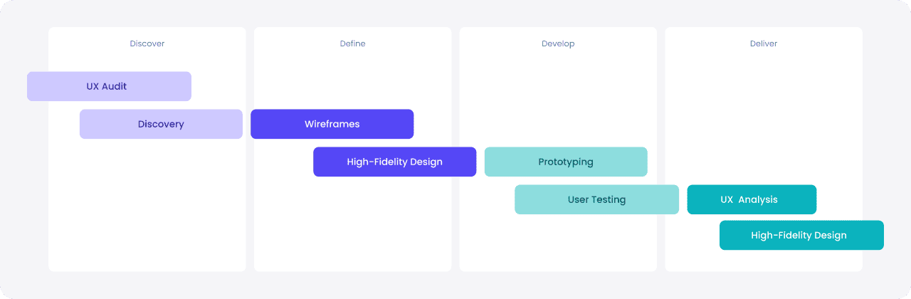
We proceeded with a 8-week engagement to transform the exisitng UI/UX and define a clear product trajetory.
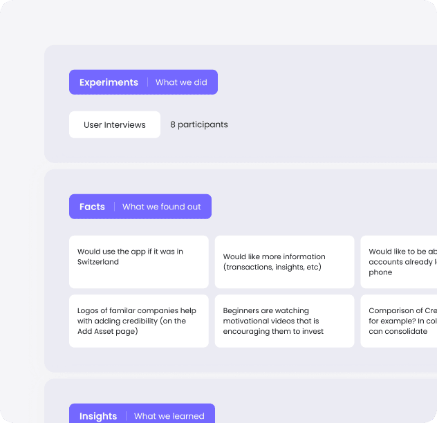
At the start of the project, we gathered all the existing research and pre-established data.
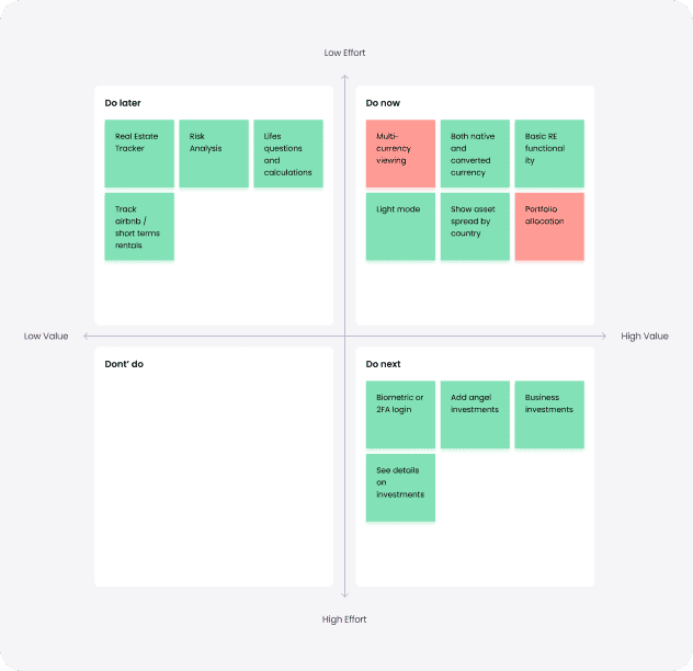
A mixture of qualitative and quantitive research was then synthesised in an atomic research canvas to understand critical insights. With precise data to work with, we ideated on potential features that users would find valuable and used a prioritisation matrix to understand what would be high value / low effort to tackle first.
As a finance product with sensitive integrations such as your bank account, crypto wallet and credit cards, we needed to define a polished interface that conveyed a high level of trust.
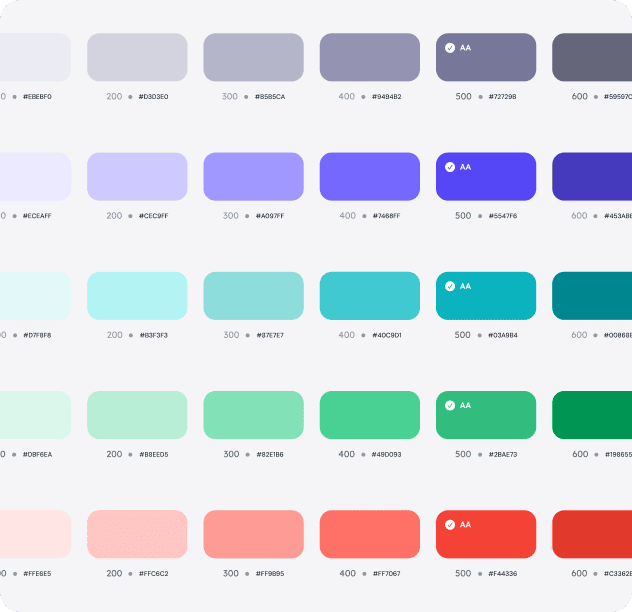
The strategy was to use enterprise-style design components with modern typography to give the right impression. We also devised light and dark mode variants to empower the user with their colour preferences.
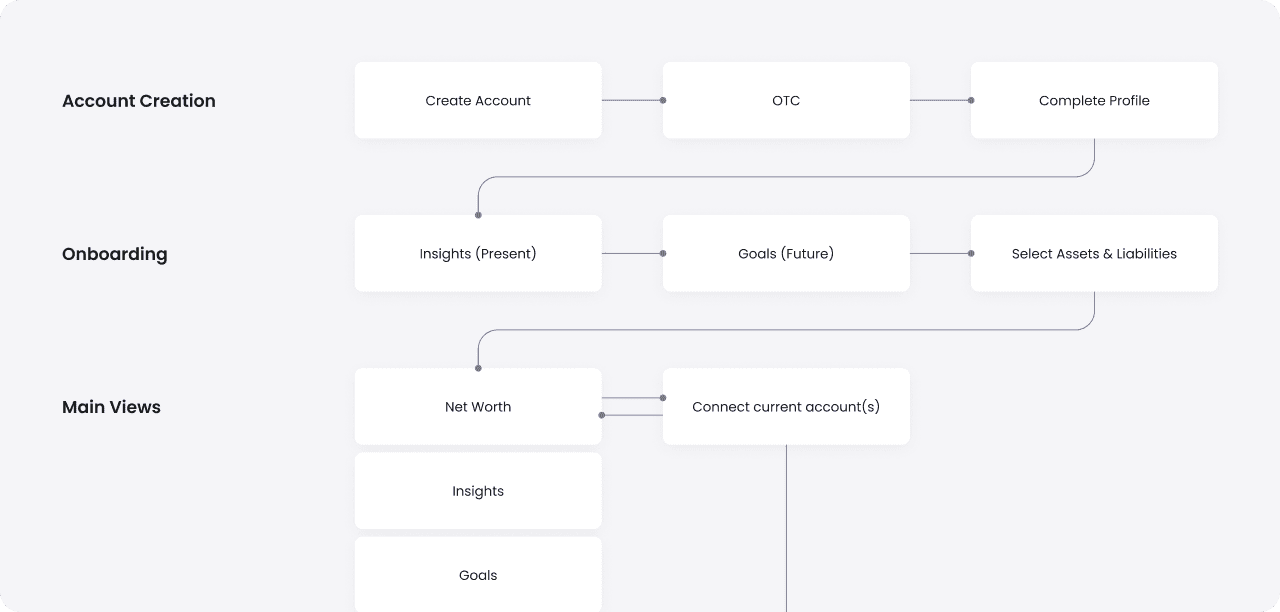
Time-to-value was a key consideration for Strabo to ensure the onboarding flow yielded the maximum number of customer acquisitions.
We made sure to balance delivering a personalised experience and enabling the user to onboard in the shortest possible timeline. Key features were also planned in the flow, such as the net worth tracker and financial goals.
Ideation was carried out in a low-fidelity form to test different solutions and solidly the best approach.
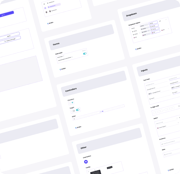
With no prior design system in place, we build an enterprise-standard Atomic design system for Strabo. With components, typography, colours and much more, screens can now be constructed 10x faster.
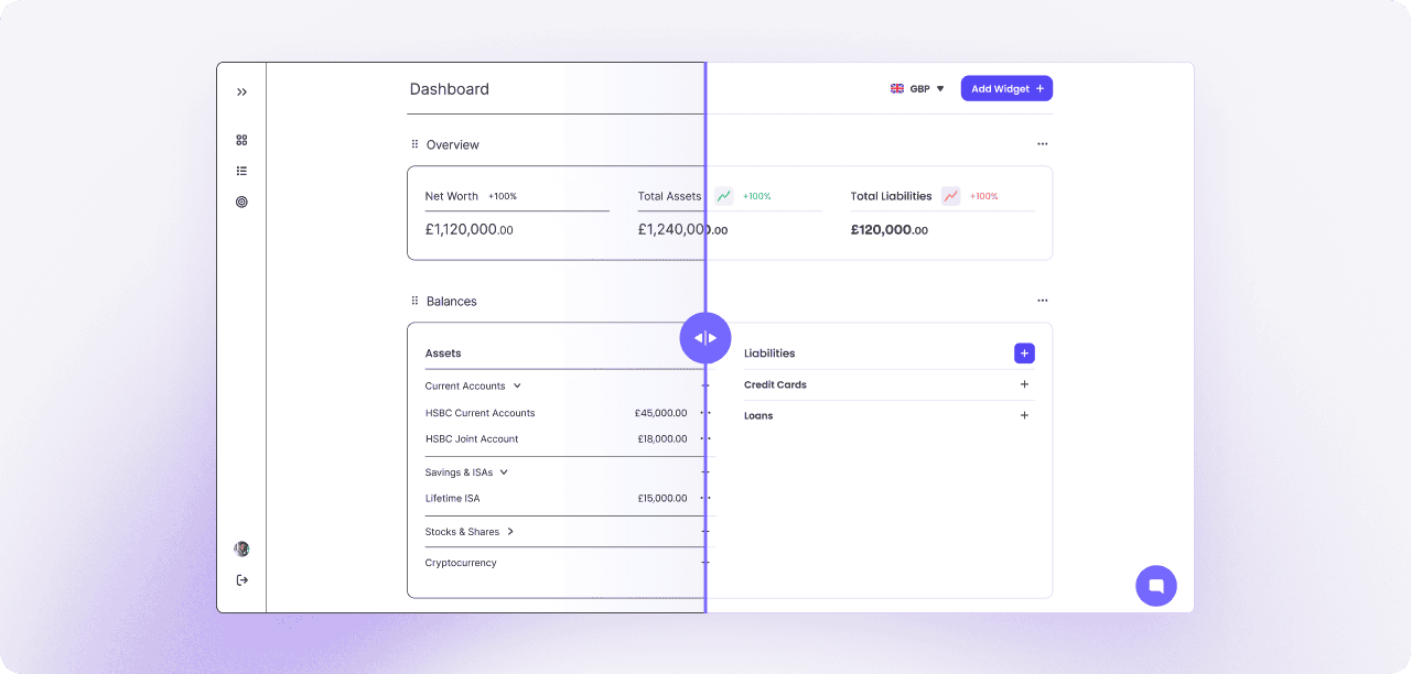
From Wireframes to a Sleek, Data-Driven Interface
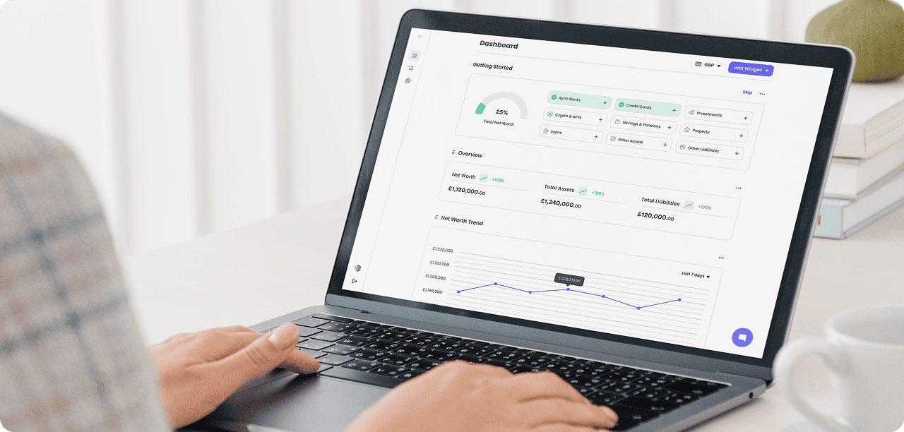
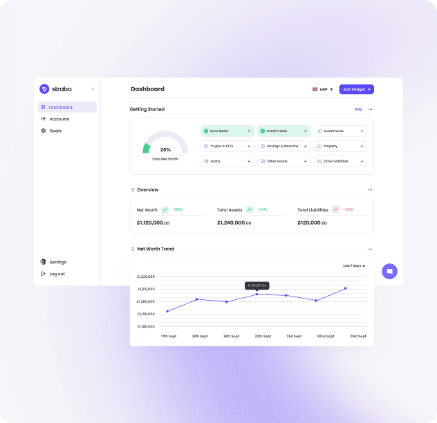
After finalizing the wireframes and core solution framework, we focused on crafting a visually compelling, high-contrast interface that enhances clarity, usability, and engagement for Strabo users. The design was developed to seamlessly integrate complex financial data into an intuitive and digestible experience.
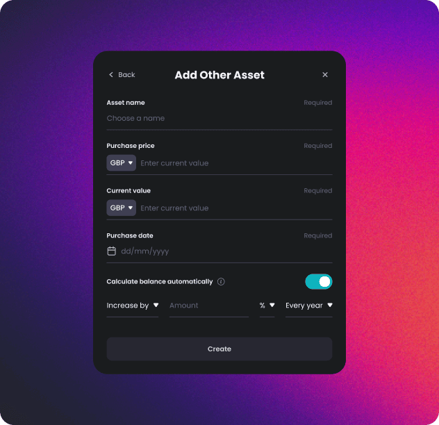
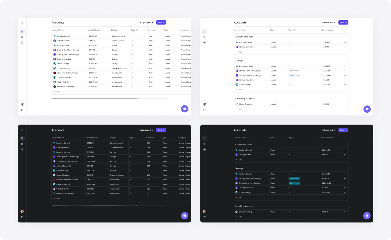
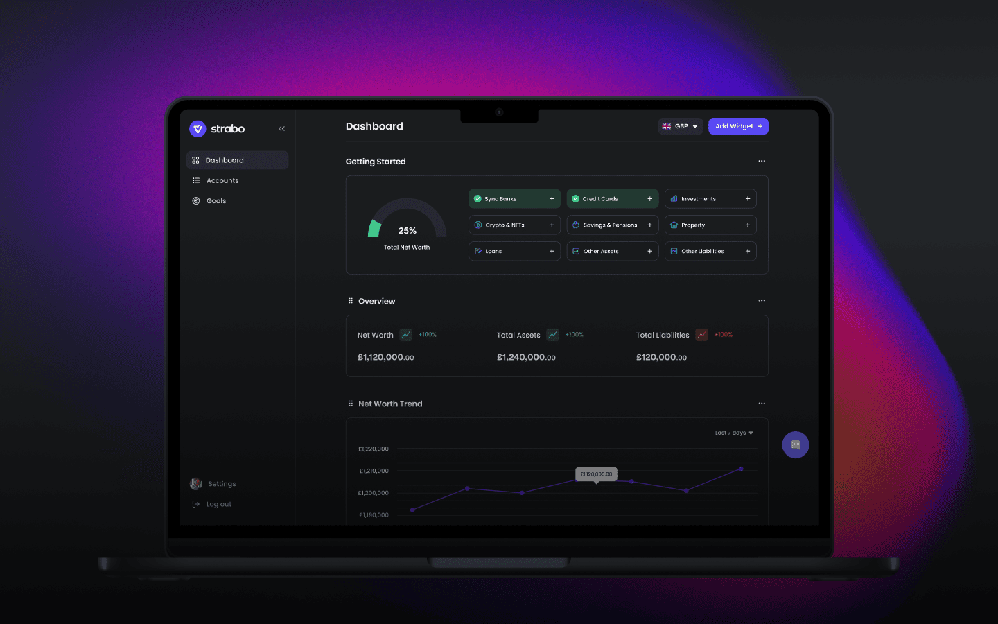
A Data-Driven, Scalable, and Intuitive Financial Platform
Our design approach for Strabo focused on transforming complex financial data into a seamless, user-friendly experience. By integrating modern UI aesthetics, intuitive data visualization, and an optimized user flow, we created a platform that empowers users to track, manage, and grow their wealth effortlessly.