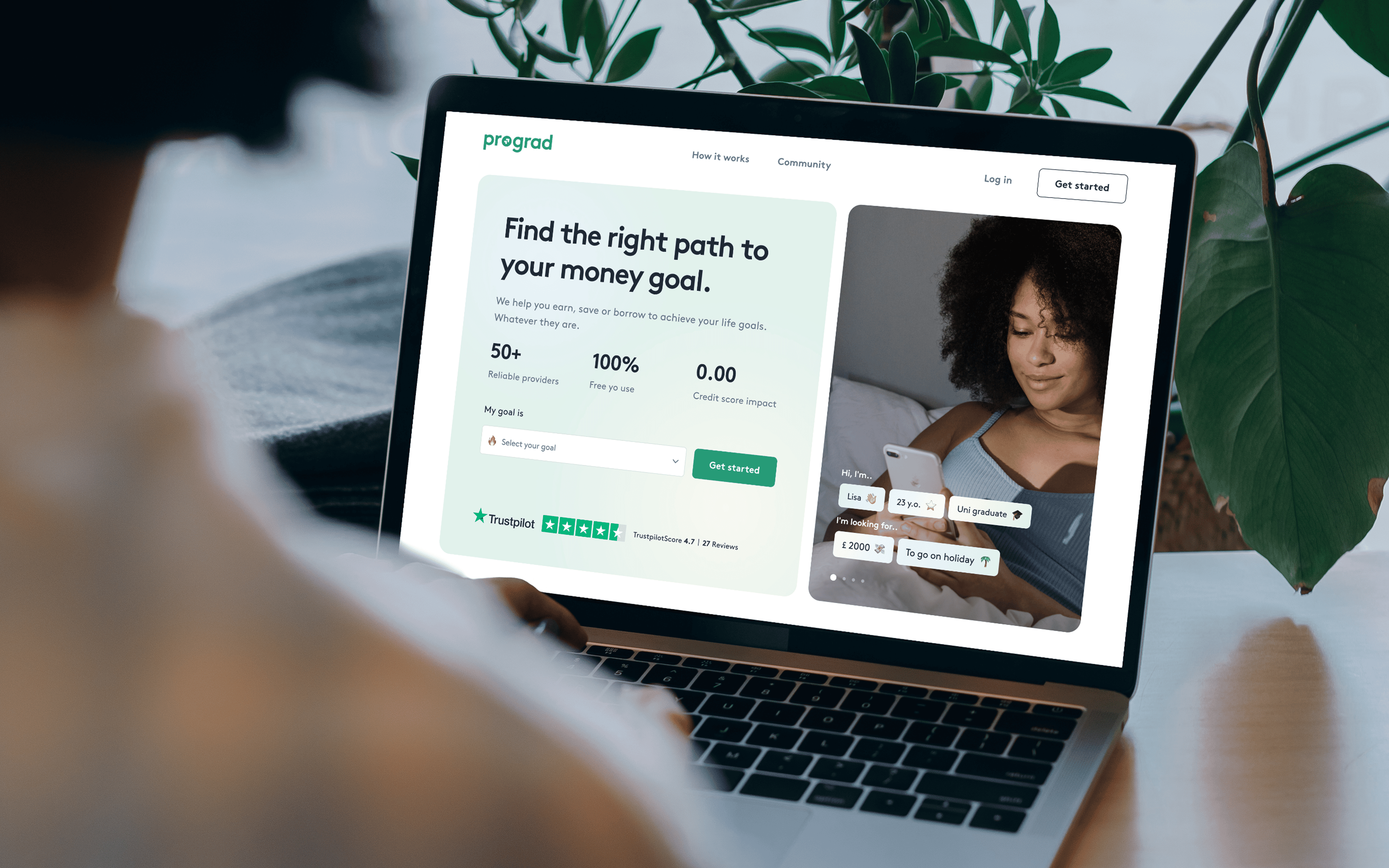
Prograd helps you find the right solution to your money goal by providing ways to earn, save or sustainably borrow the money you need to build a better life.

A high drop-off rate on the onboarding flow
Solving this problem was crucial to the product’s growth. Some common issues included a confusing and difficult-to-use interface, a lack of clear value proposition for the user, and a lack of guidance and support.
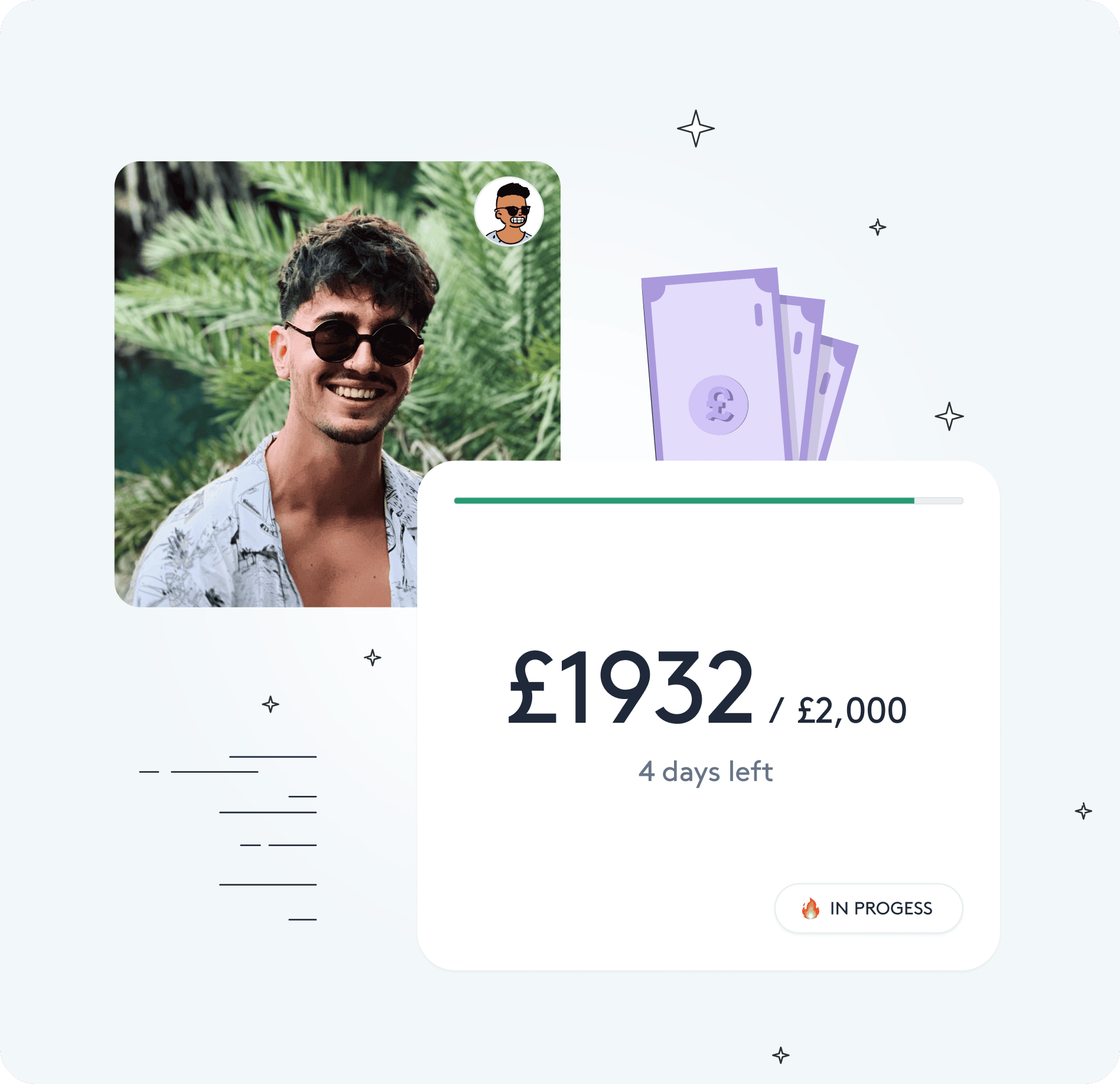
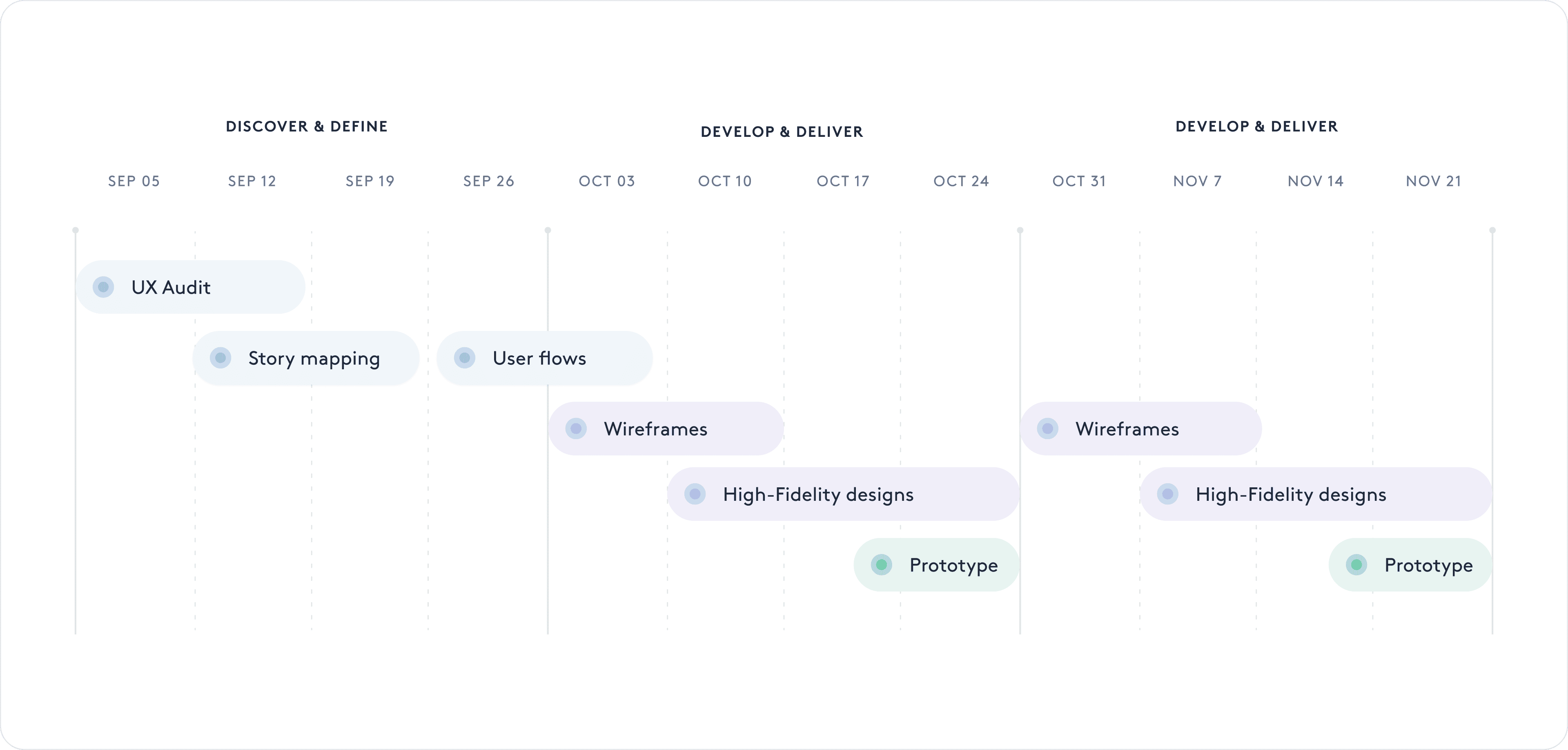
We proceeded with a range of UX exercises to better identify the root cause of our problem and provided the new & more engaging user flow as well as updated user experience
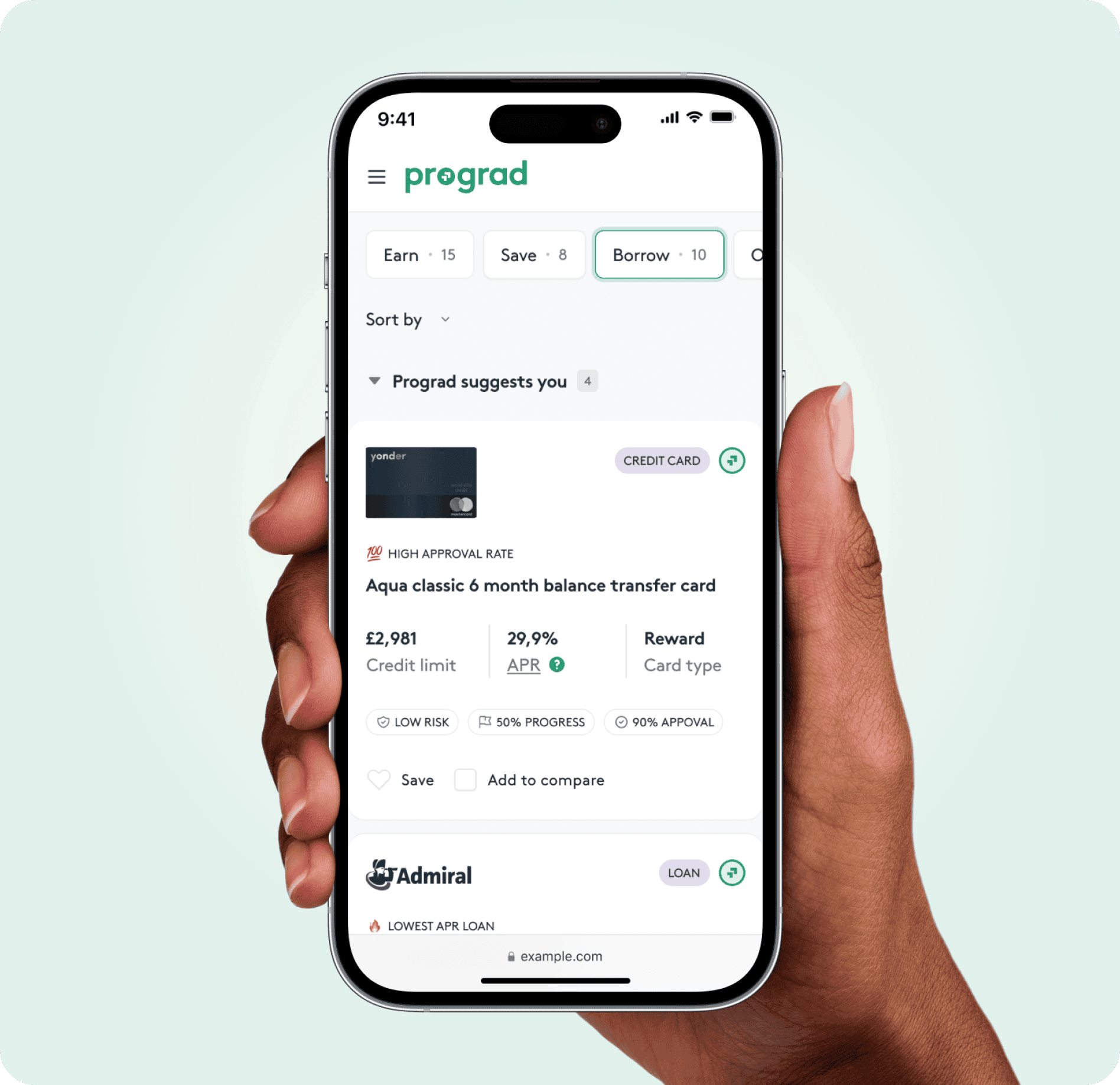
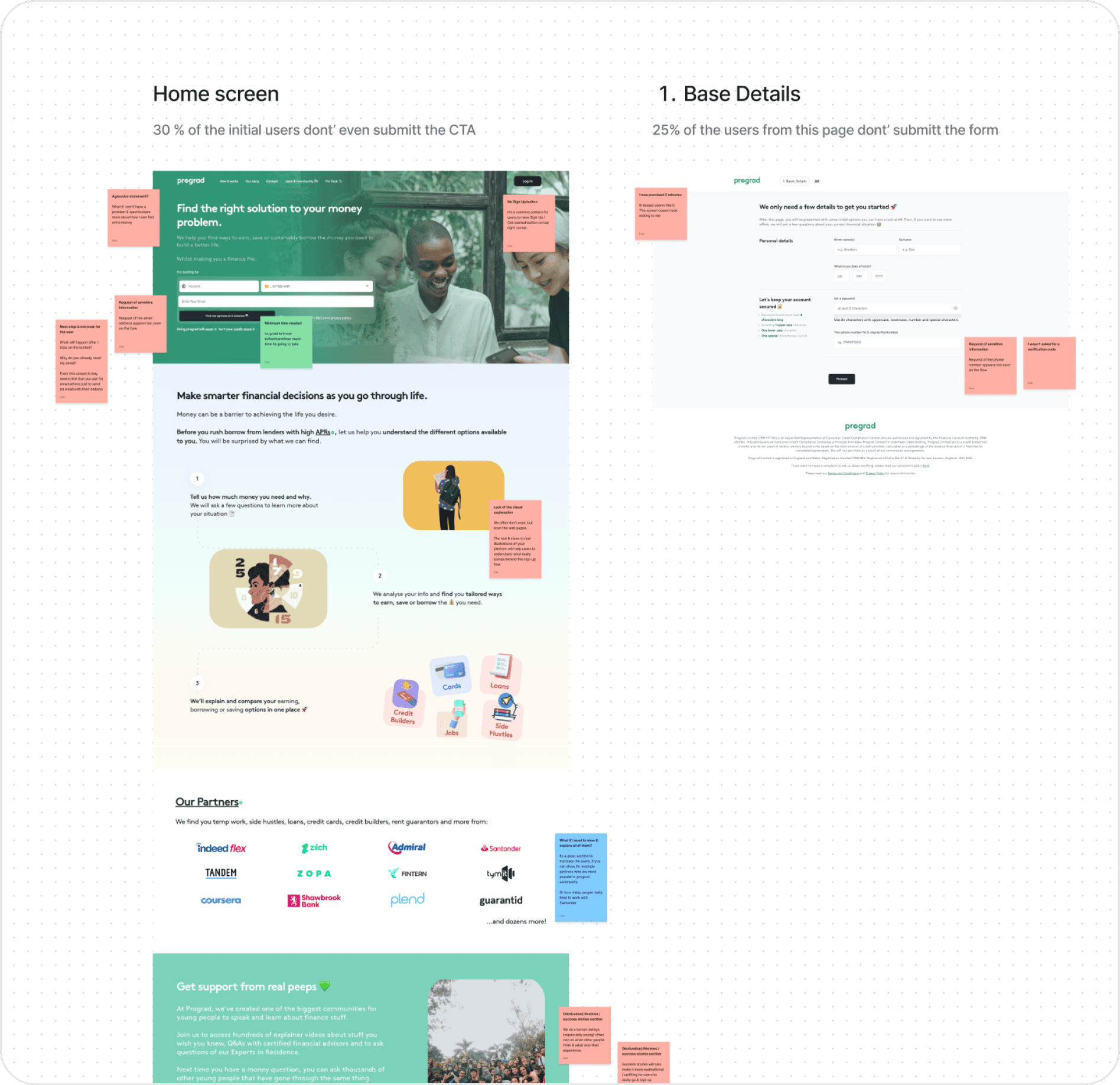
Identifying UX Challenges in the Onboarding Process
A high drop-off rate in the onboarding flow was preventing user activation and limiting product growth.
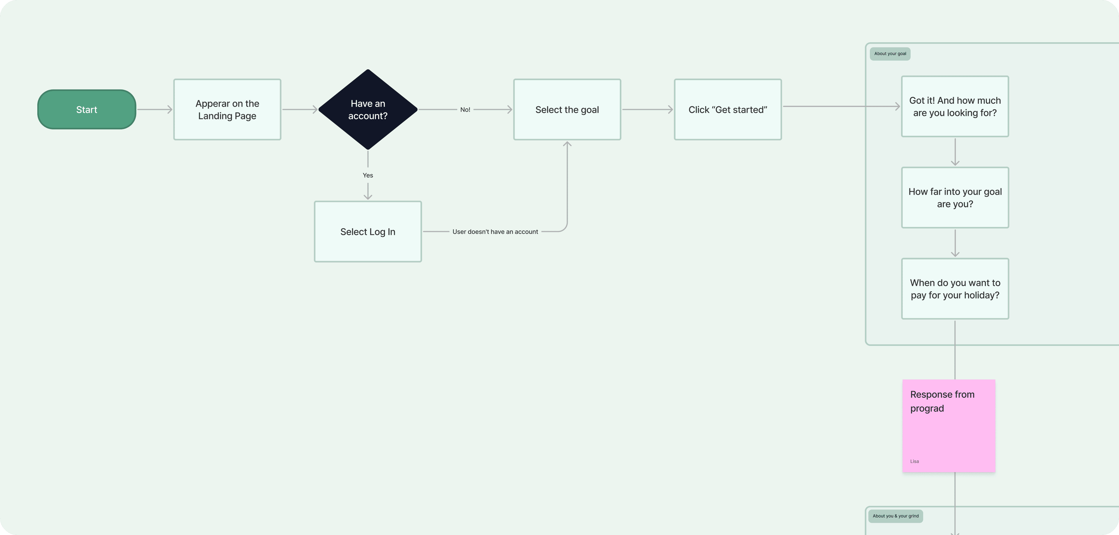
Uncovering Pain Points and Designing a Frictionless Experience
We also needed to make experience more engaging and valuable to encourage users retention.

Creating an Engaging & Intuitive Onboarding Flow
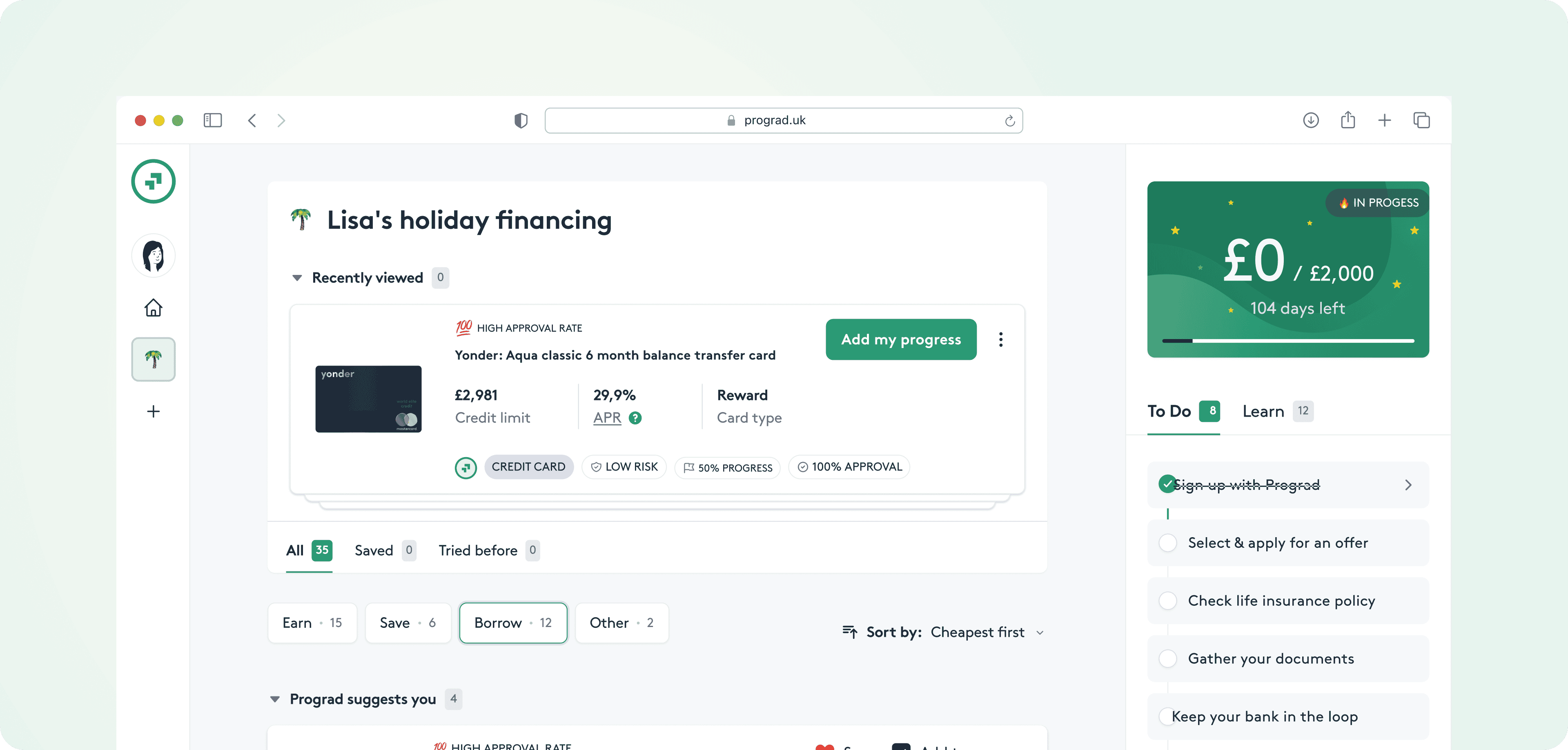
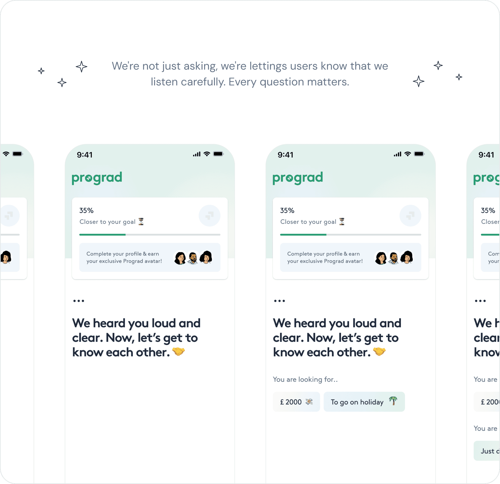
We reimagined the onboarding flow with a clear, structured, and user-friendly approach that helps users understand the product’s value and take action faster.
Bringing the Redesigned Onboarding Flow to Life
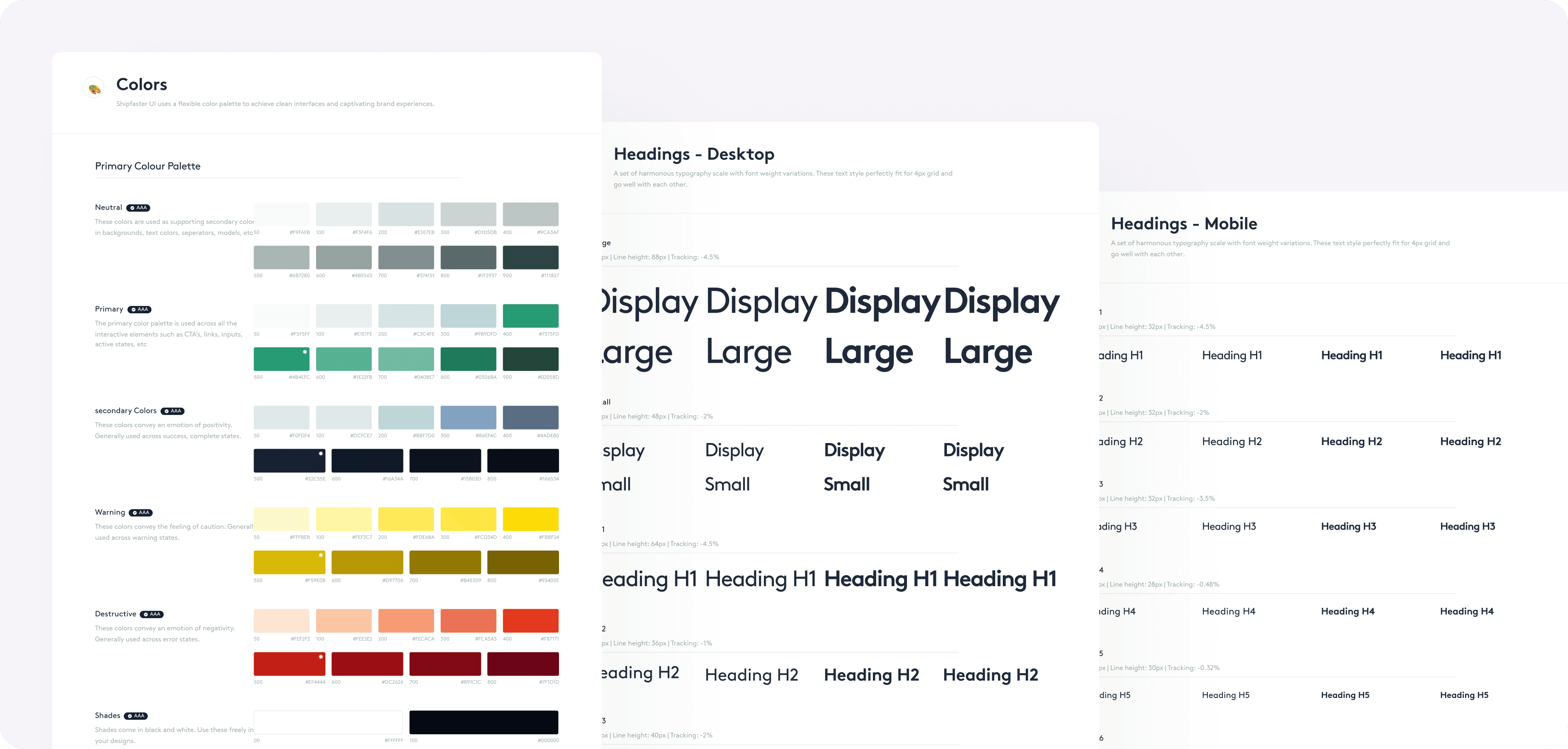
After finalizing our research insights and UX/UI designs, we moved into the development phase, ensuring that the new onboarding flow was seamlessly integrated into the app. Our focus was on maintaining design consistency, optimizing performance, and ensuring a smooth user experience across all devices.
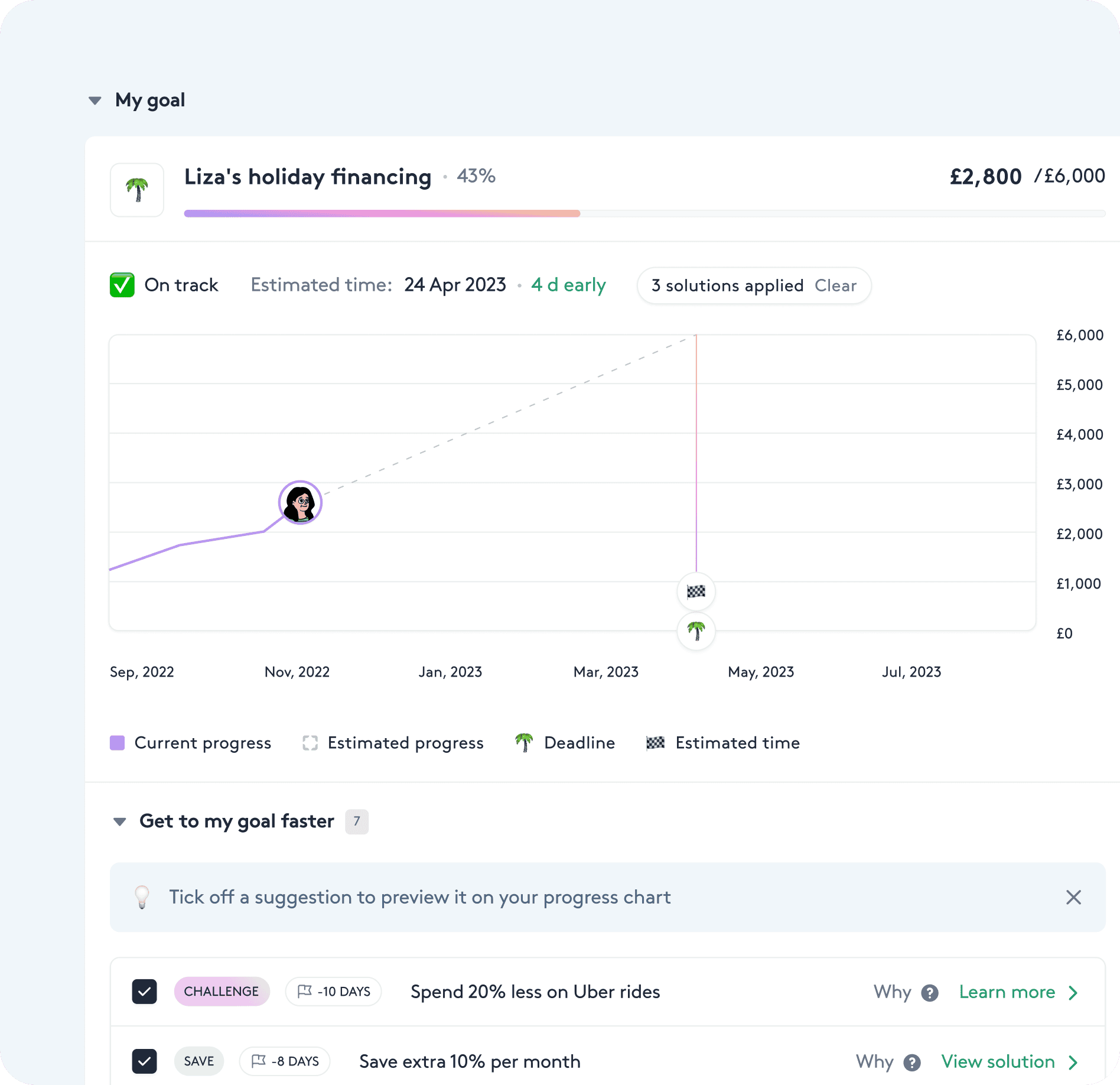
Optimizing the Design for an Engaging Mobile Experience
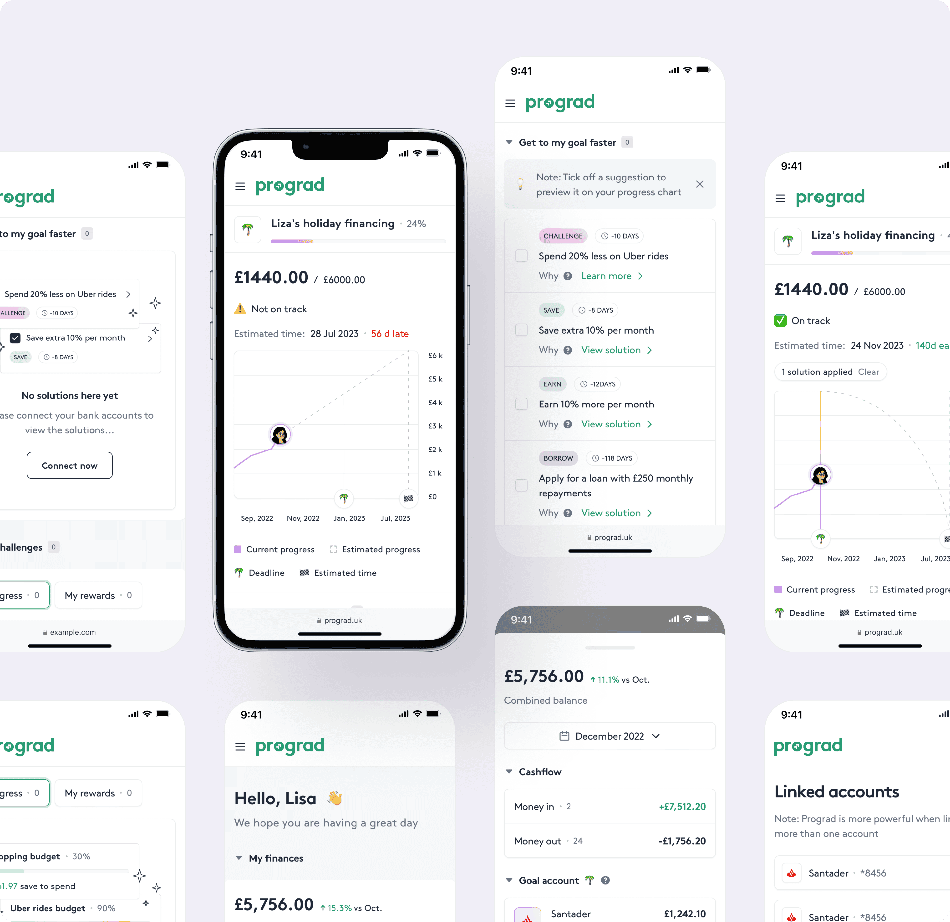
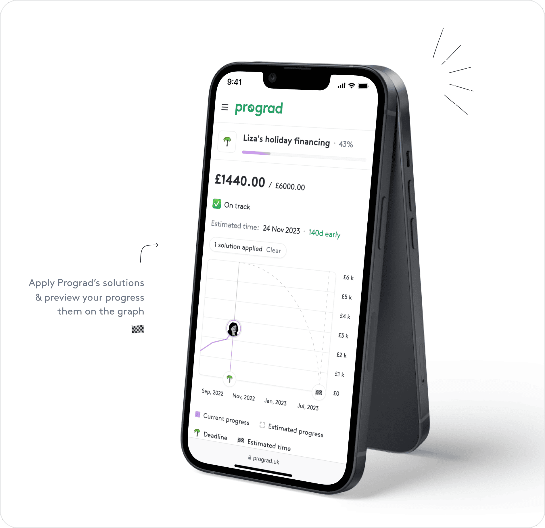
With mobile users making up a significant portion of the audience, we tailored the onboarding flow to ensure a smooth, intuitive, and engaging mobile experience. Our goal was to create a responsive, touch-friendly interface that adapts effortlessly across different screen sizes while maintaining the same clarity, guidance, and usability as the desktop version.
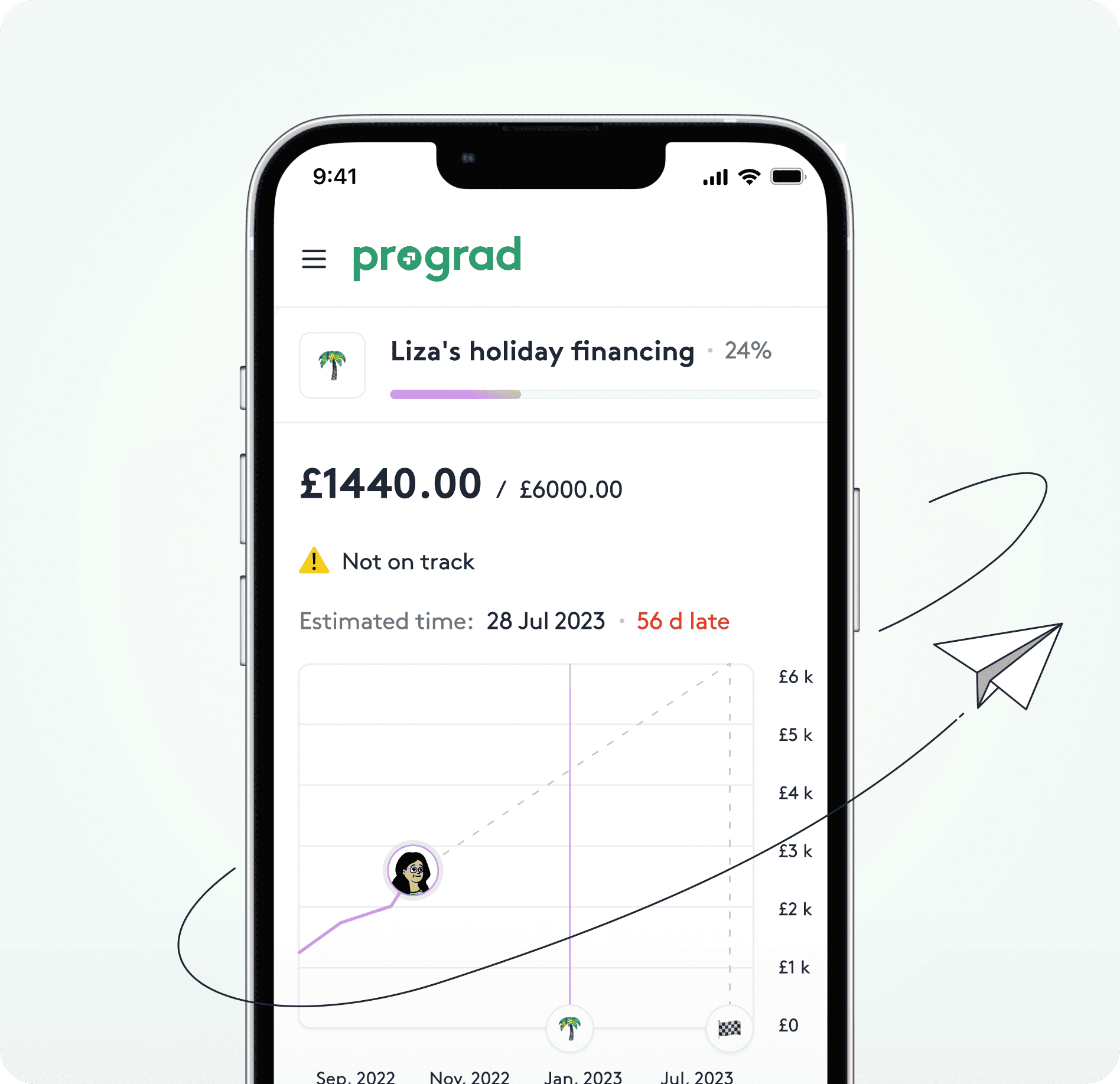
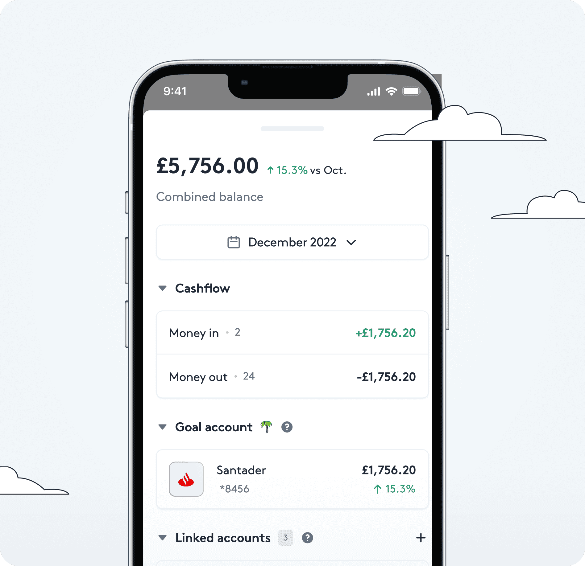
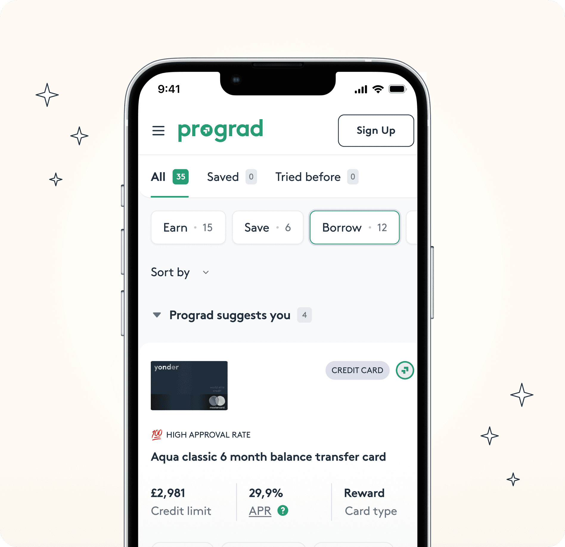
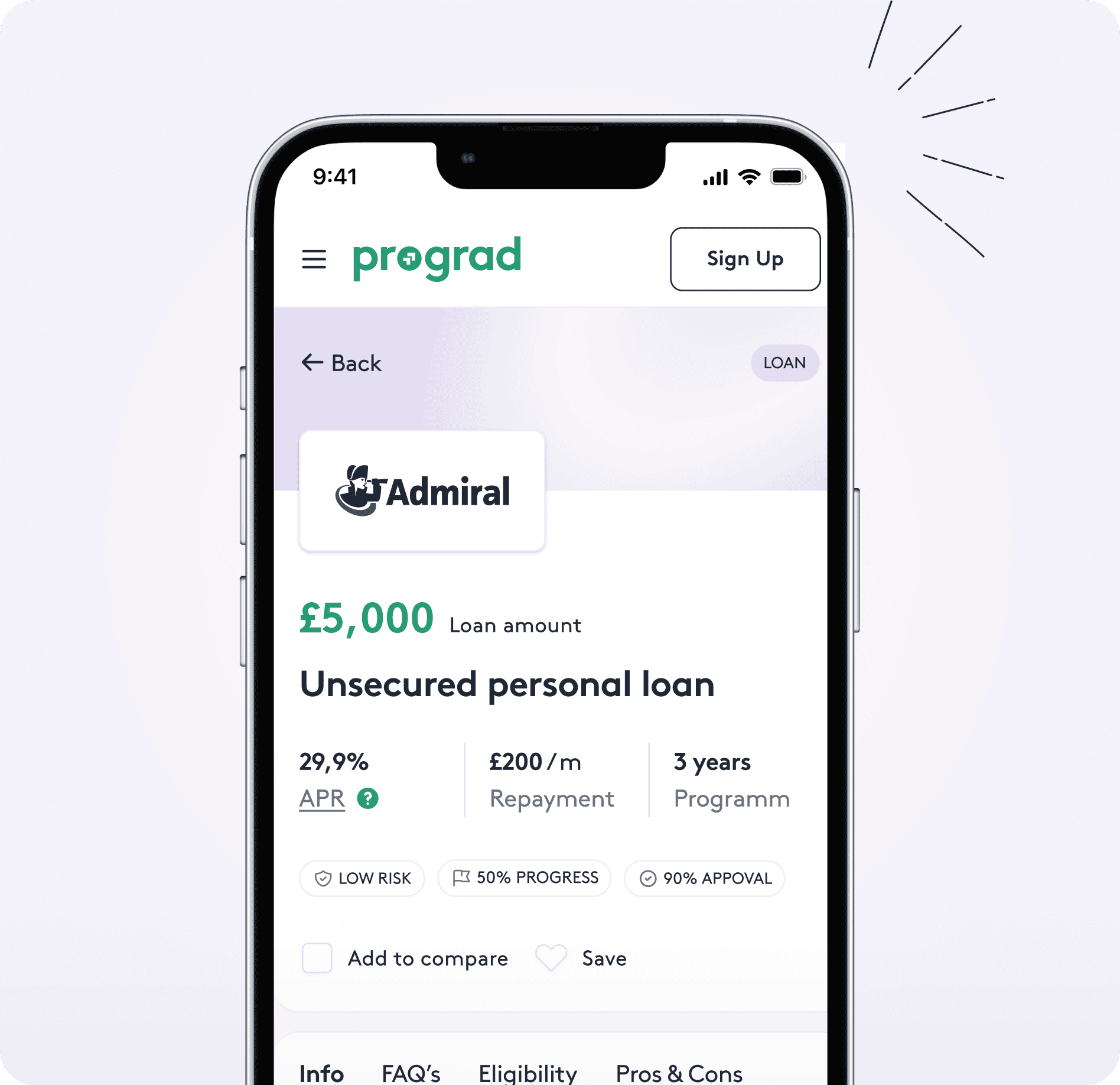
A Smart, Intuitive, and Goal-Oriented Financial Experience with Prograd
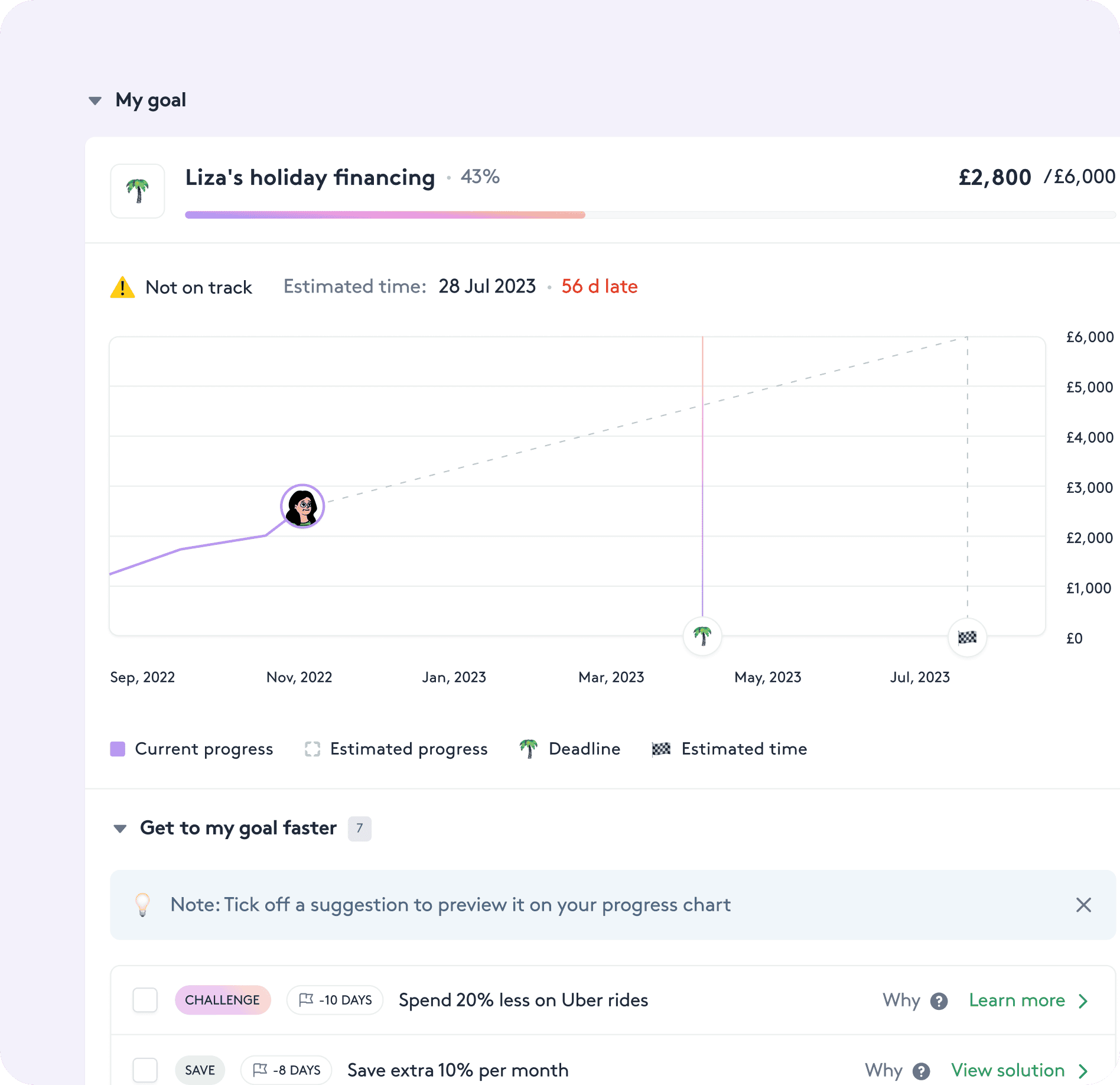
The design of Prograd was meticulously crafted to provide a seamless, intelligent, and goal-focused financial management experience. By integrating intuitive UI elements with real-time data tracking, Prograd's users can visualize, track, and optimize their financial goals with clarity and ease.
