Orbital is a platform that allows small and medium sized businesses to manage their people, networks, devices and applications all in one place.
How do you manage people, networks, devices, and applications all in one place.
The platform aimed to provide a seamless user experience, enabling businesses to simplify their operations and save time. Our agency was tasked with conducting UX research, designing the user interface, and creating a design system to ensure consistency across all aspects of the platform.
Improved onboarding and a new dashboard
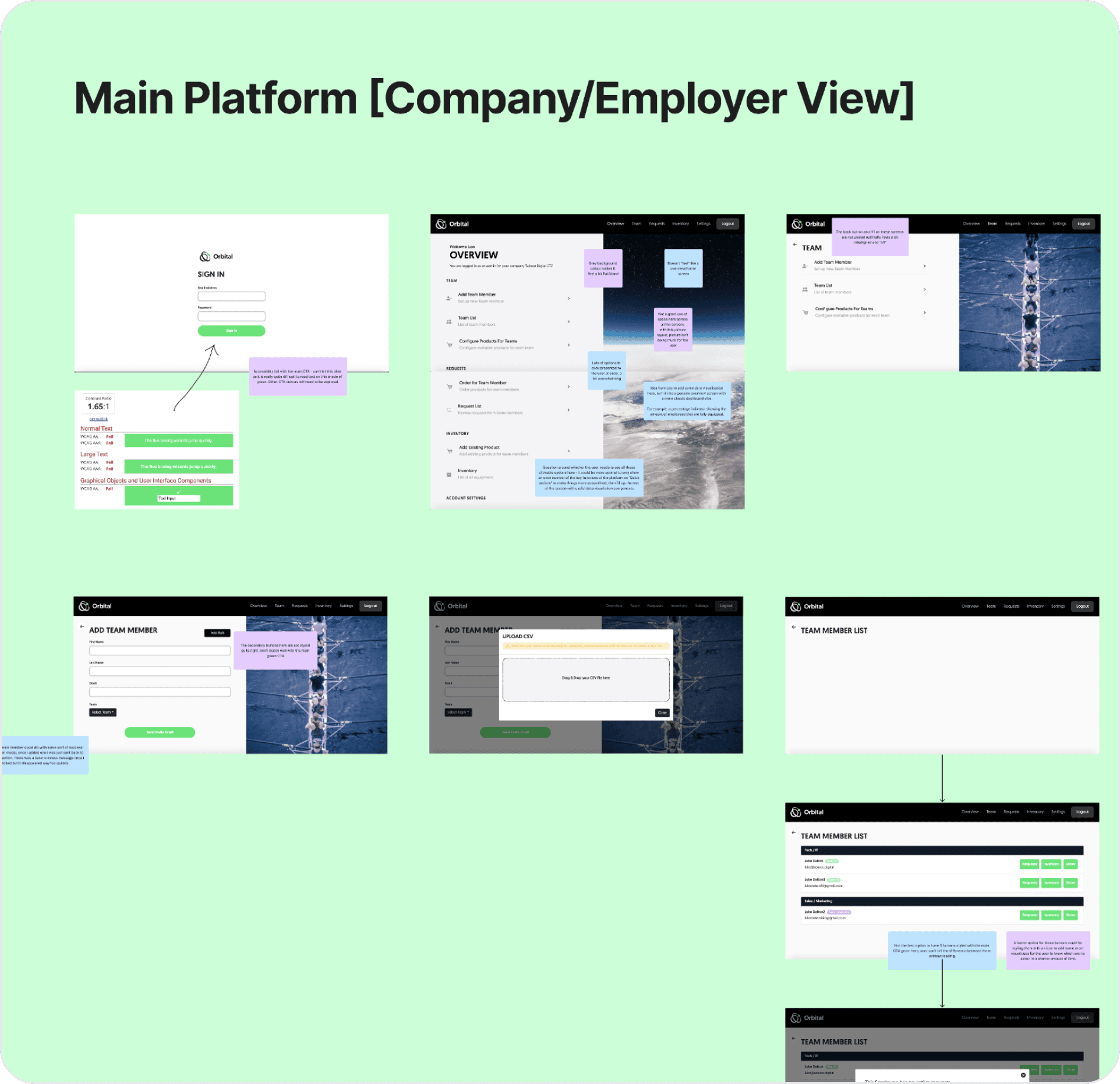
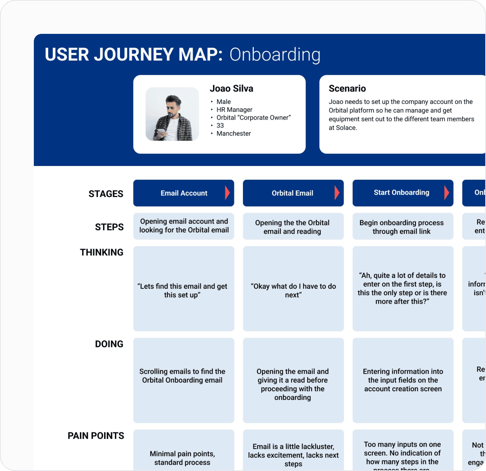
We began by conducting extensive UX research to understand the needs and pain points of the target audience.
We conducted user interviews, analysed user feedback, and created user personas to develop a deep understanding of the users’ behaviour and preferences. Through this research, we discovered that users were looking for a simple, intuitive interface that could easily manage multiple devices and applications in one place.
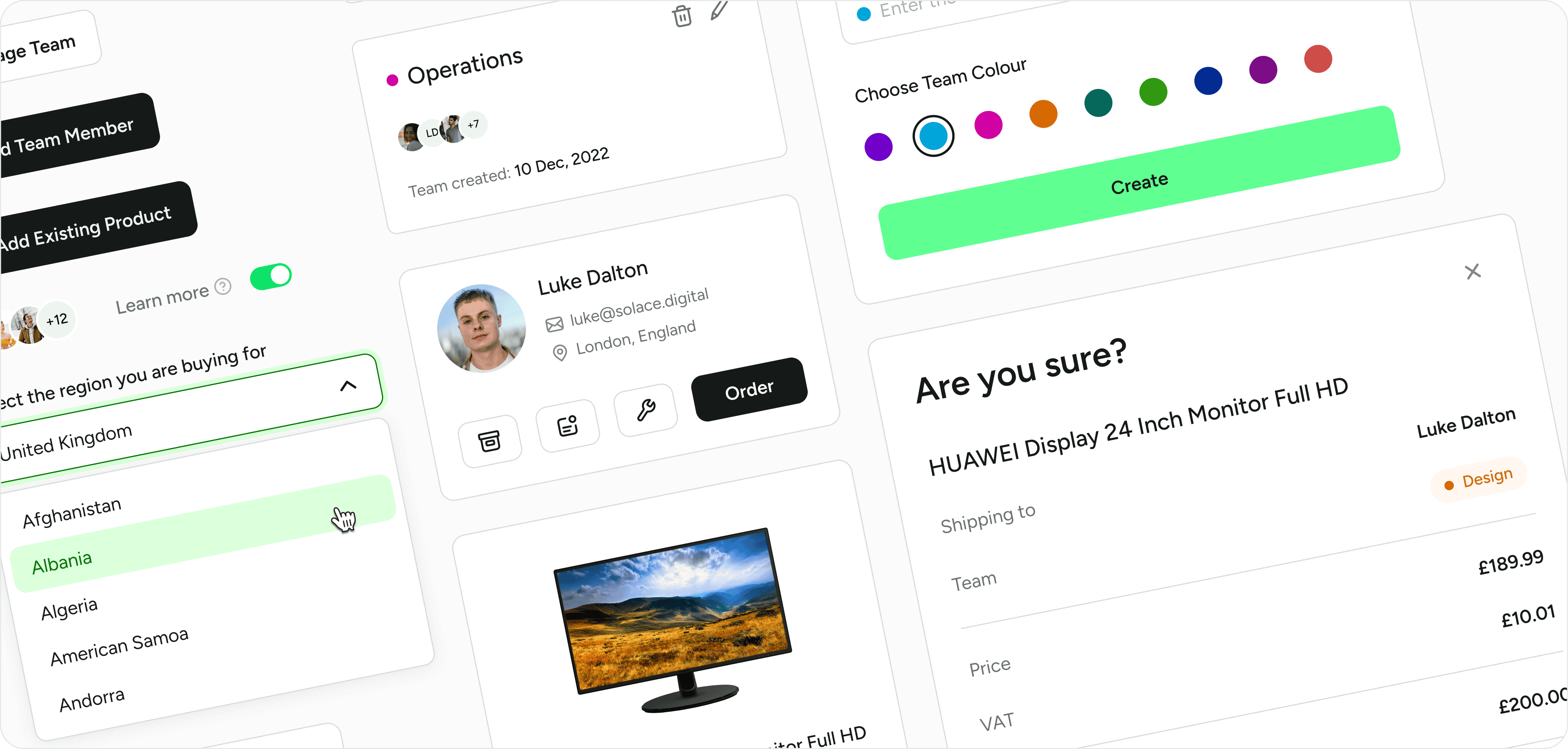
To ensure consistency across all aspects of the platform, we created a design system that provided a set of rules and guidelines for designing and building the user interface.
The design system included a library of reusable components, typography, colour palettes, and design principles that allowed for efficient and consistent design across the platform. Our design system ensured that all design elements were consistent, and any future design changes would be easier to implement.
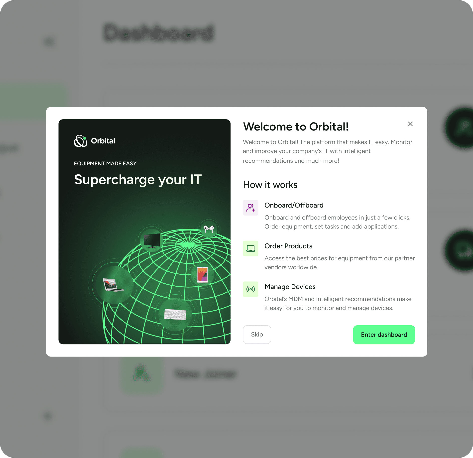
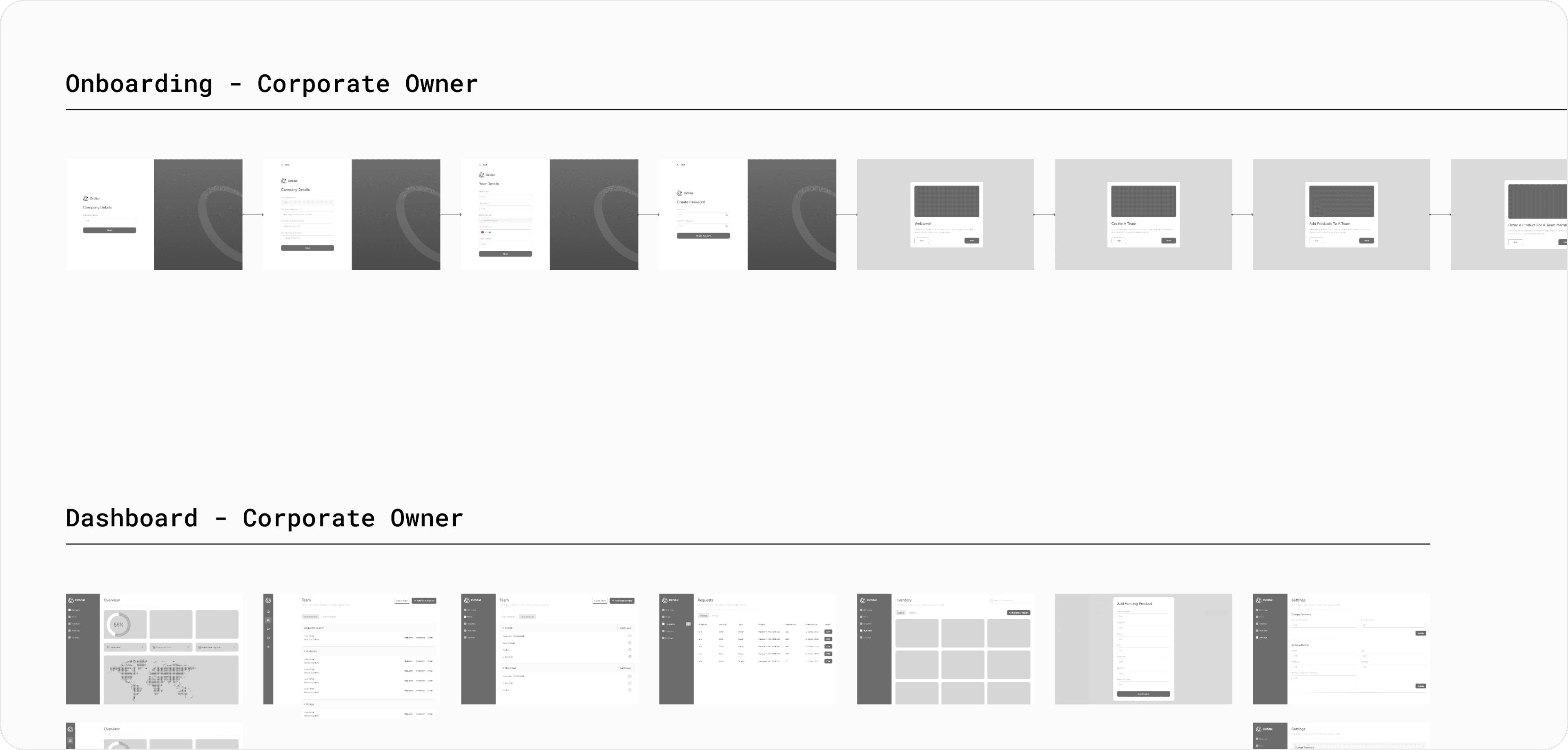
One of our main goals was refining the onboarding. The flow for the corporate users was lacking in visual aesthetics and presented the user with too many inputs on a single screen.
We broke this up in a few separate stages to reduce cognitive load and to give Orbital space on the right for marketing copy.
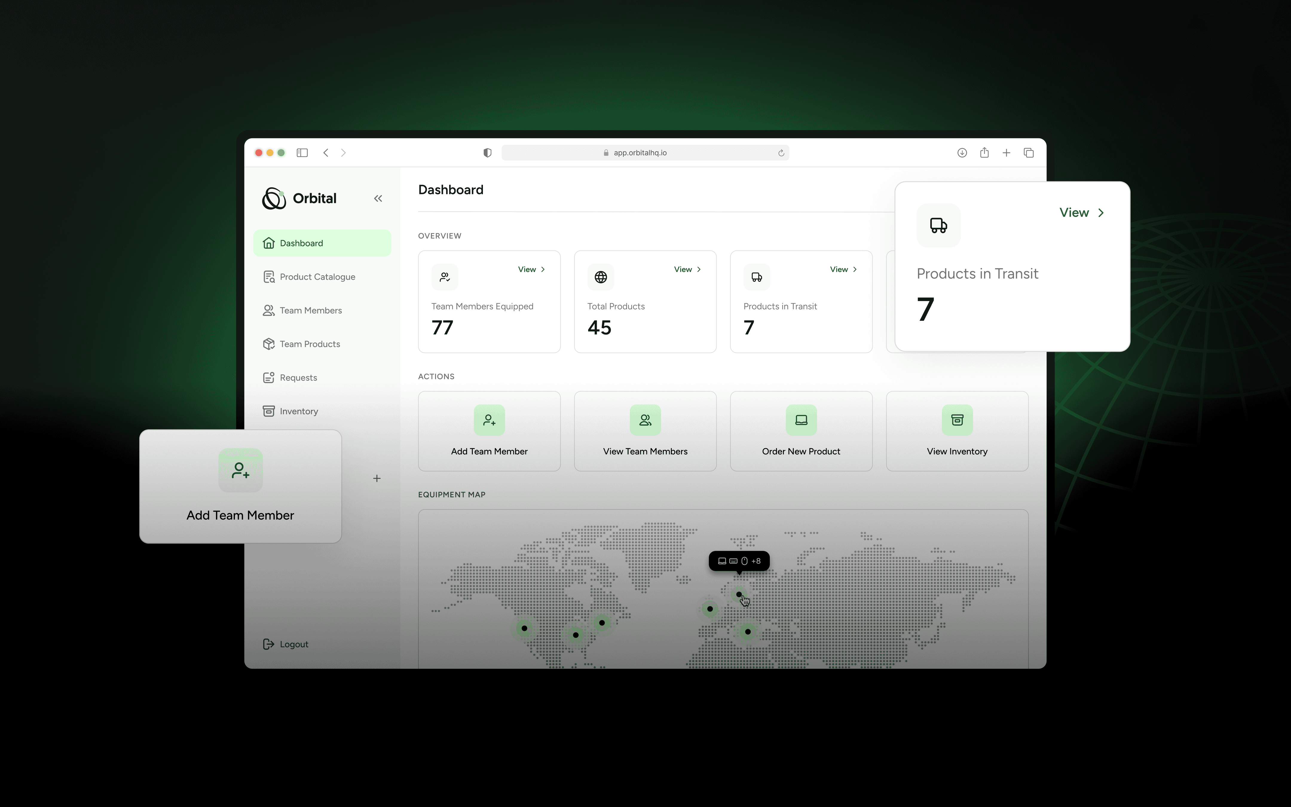
The original product did not feature any kind of overview screen.
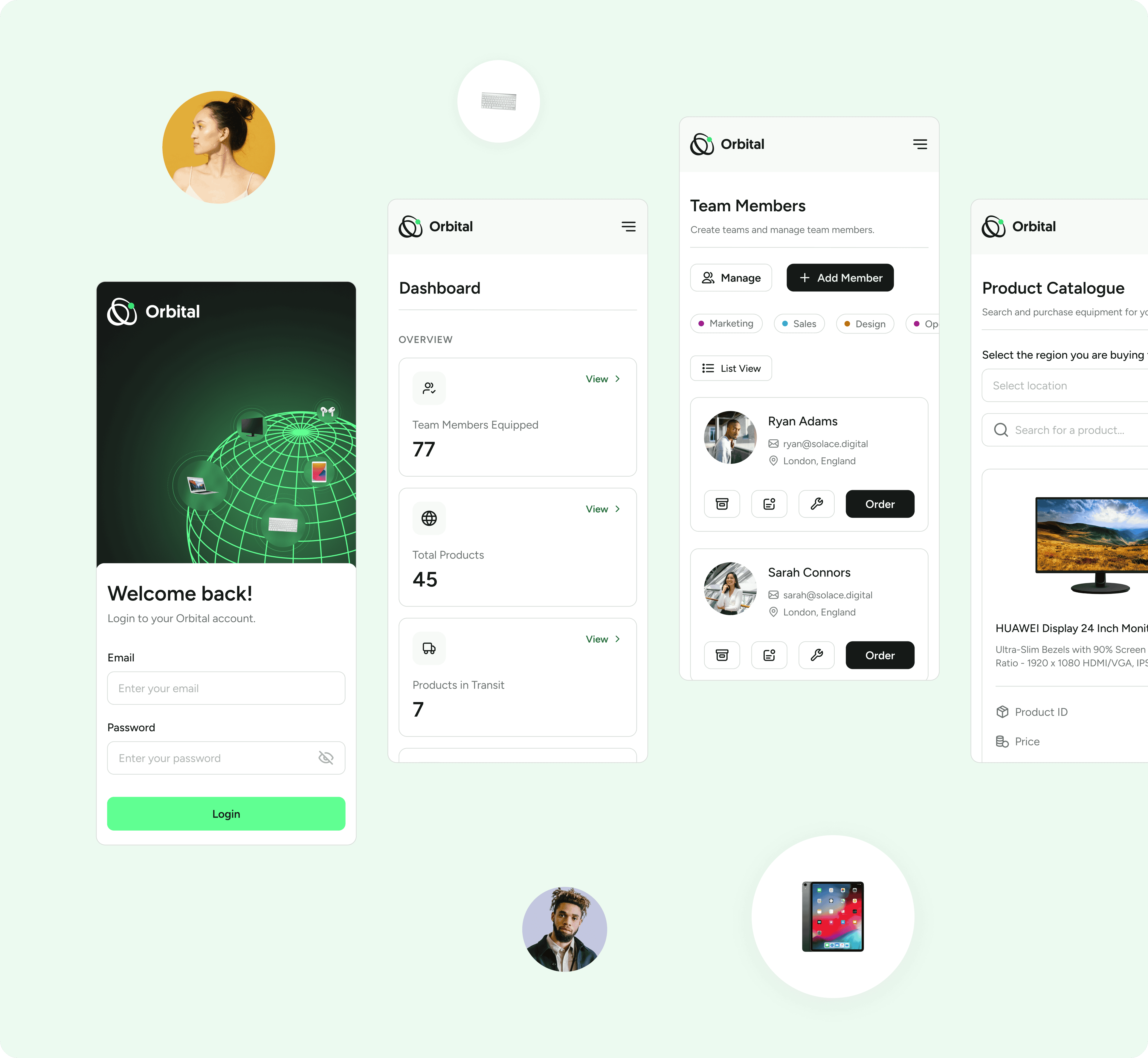
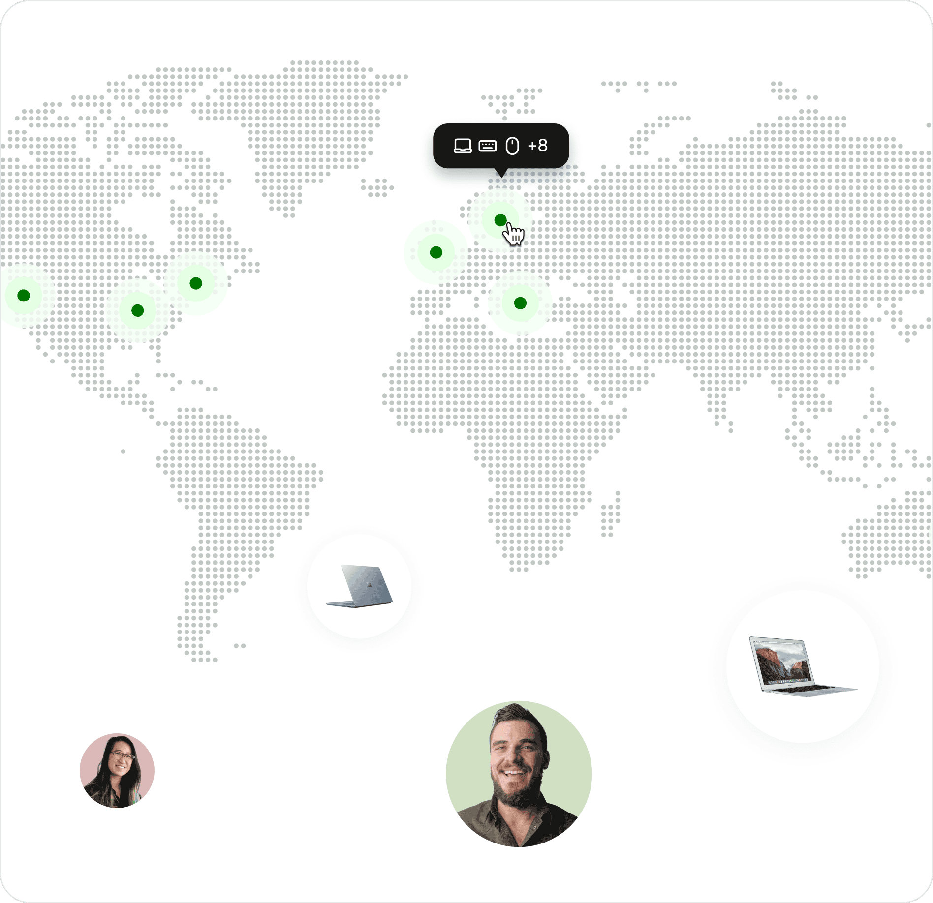
We decided to design a dashboard view that allowed the user to track key metrics and perform some quick actions. We also included an interactive map that can be used to track the location of team members and view the equipment they currently own.
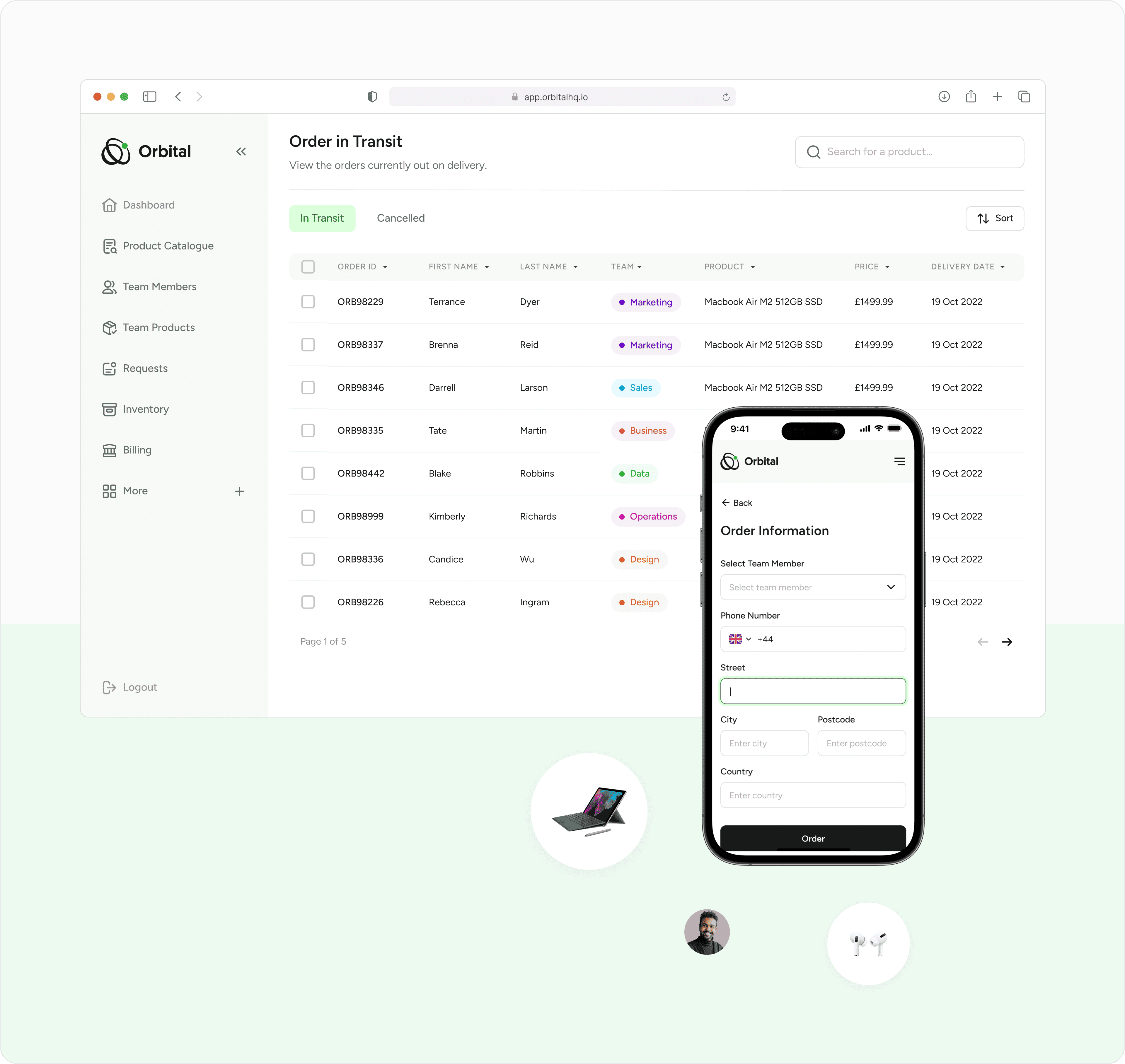
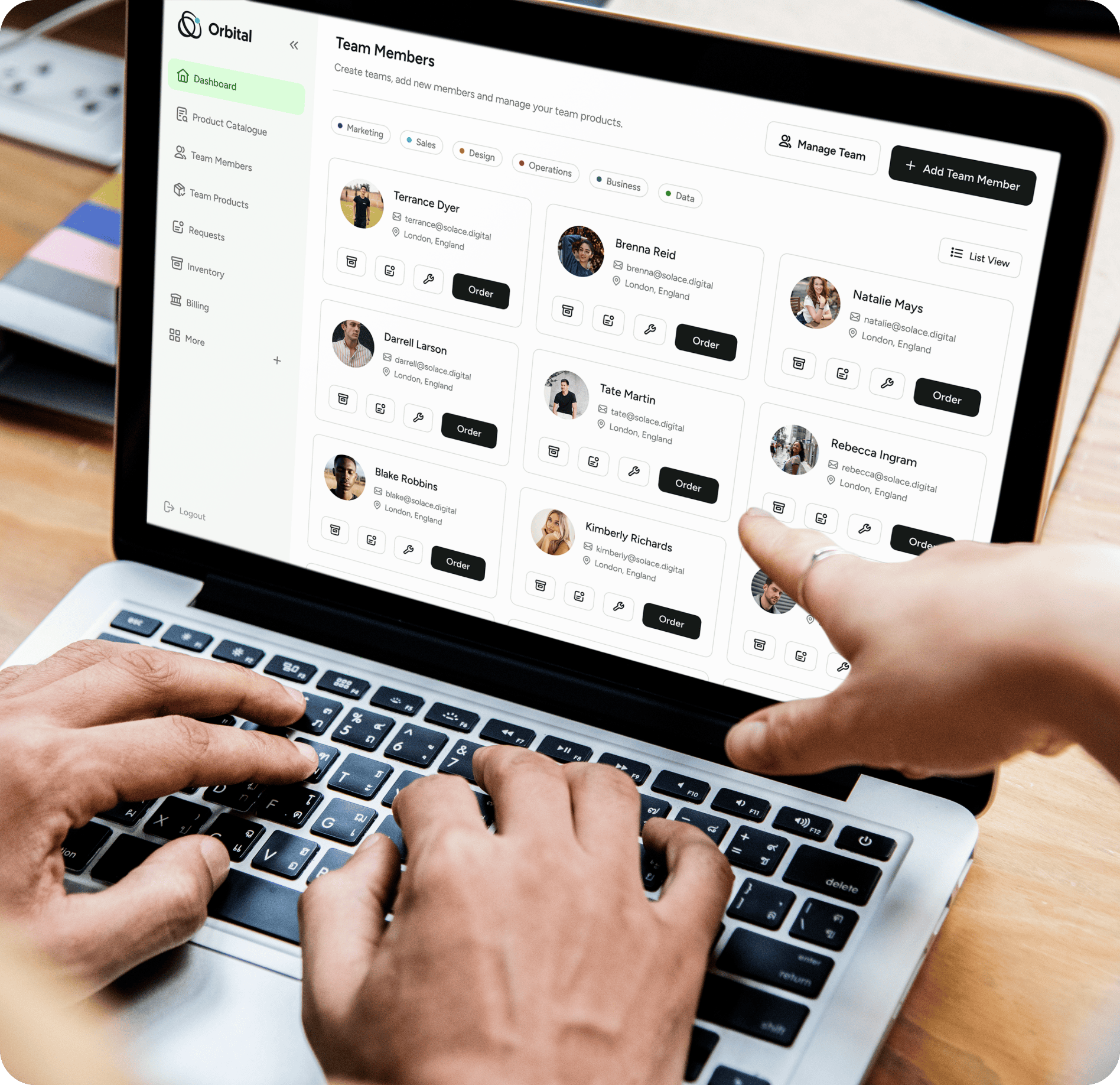
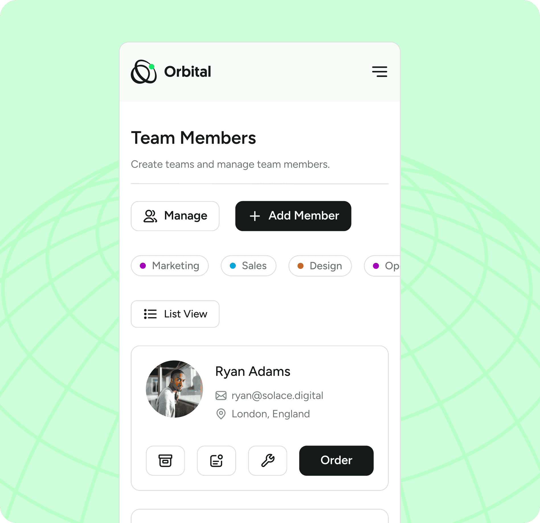
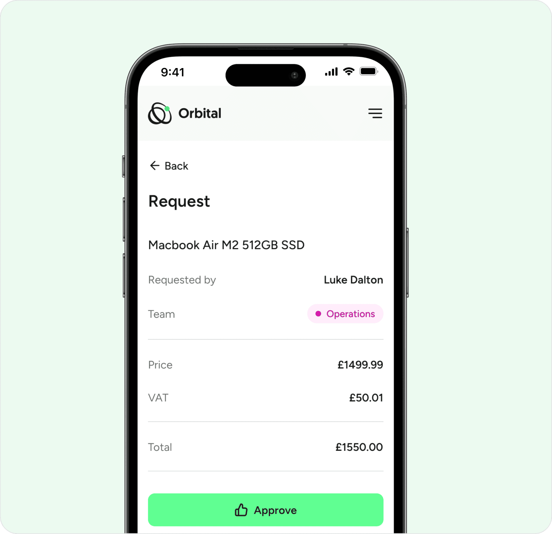
We crafted a modern, clean-looking interface design that would help ensure a smooth experience for users of the Orbital platform.
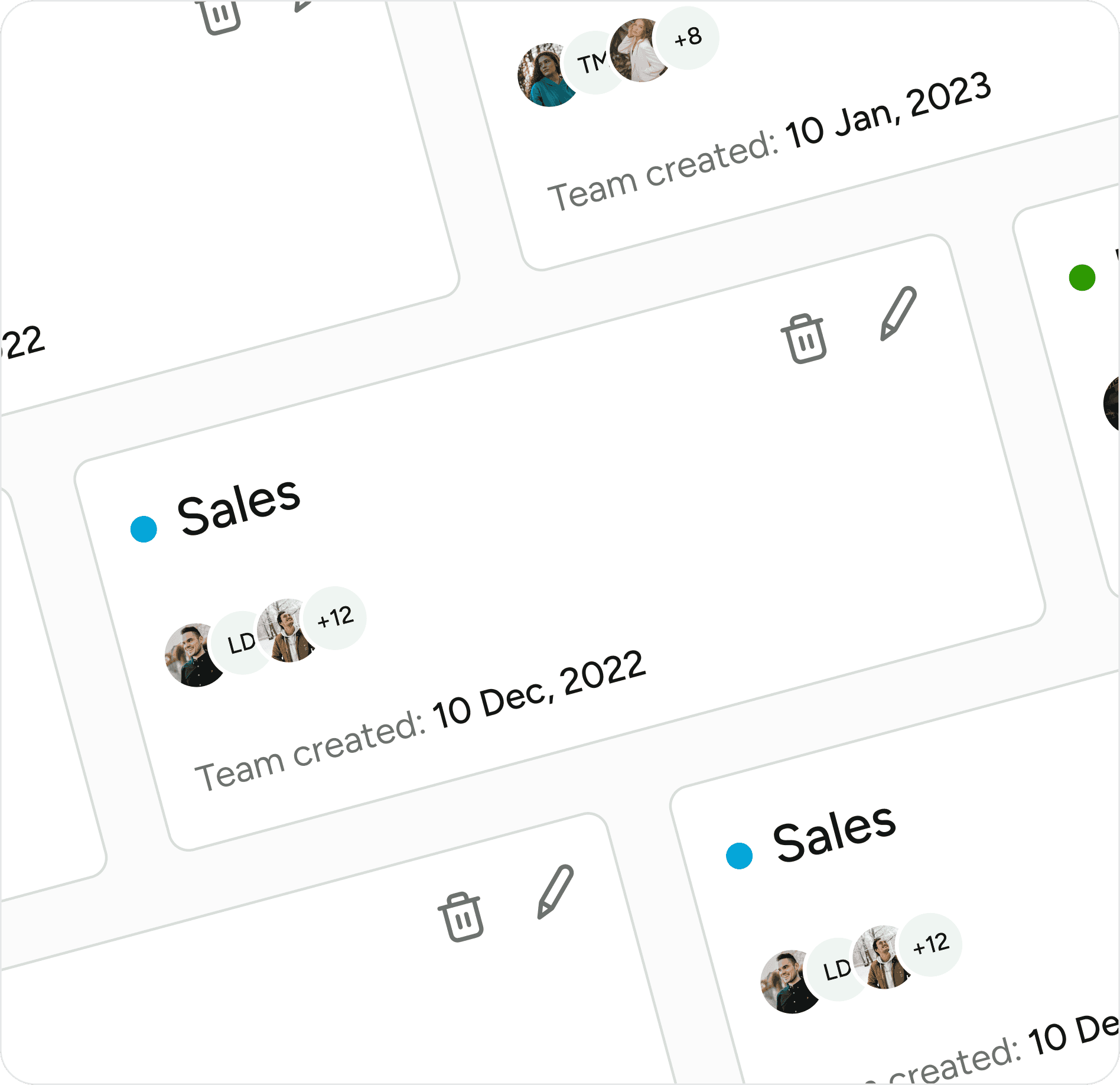
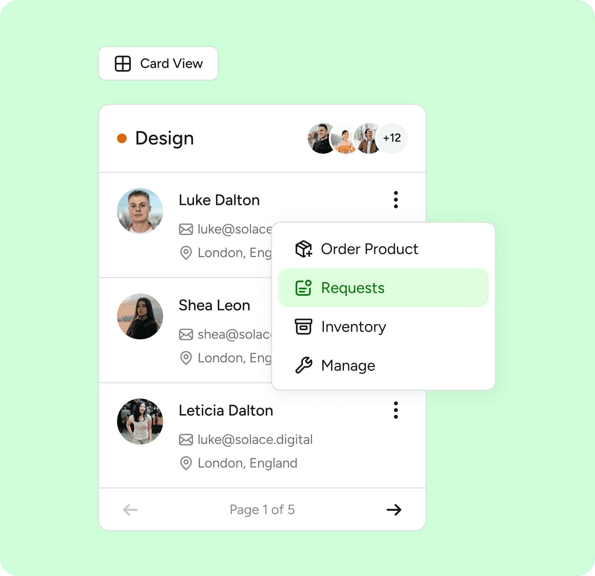
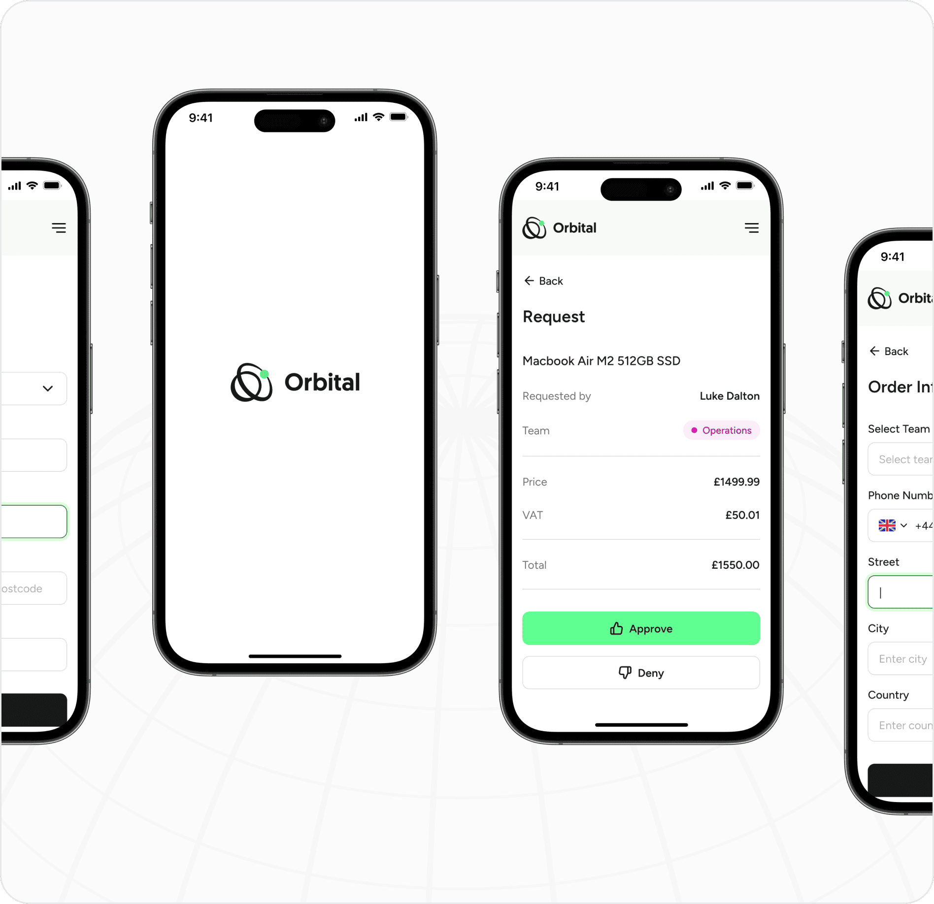
We added lots of new additions such as new and improved table designs for managing orders, a custom tagging system for teams and improved card designs for the different products available to team members.
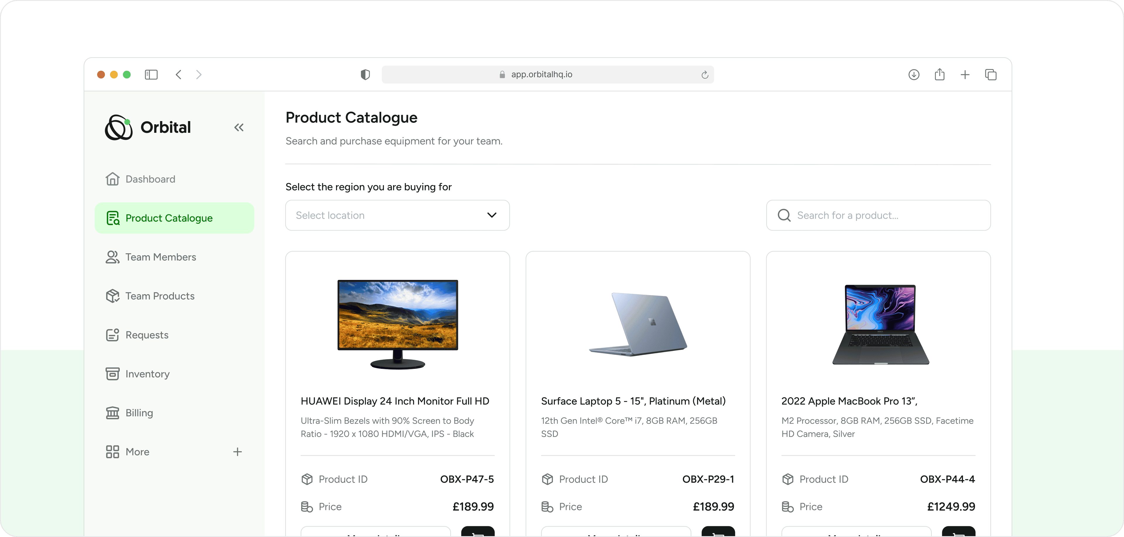
Delivering an Intuitive, Modern, and Efficient Platform for Orbital
Through strategic design and research-driven UX decisions, we transformed Orbital into a streamlined, modern, and highly functional equipment management platform. Our approach ensured that team members, administrators, and purchasing managers could efficiently manage teams, track equipment, and streamline procurement in a single, intuitive interface.
