Case study
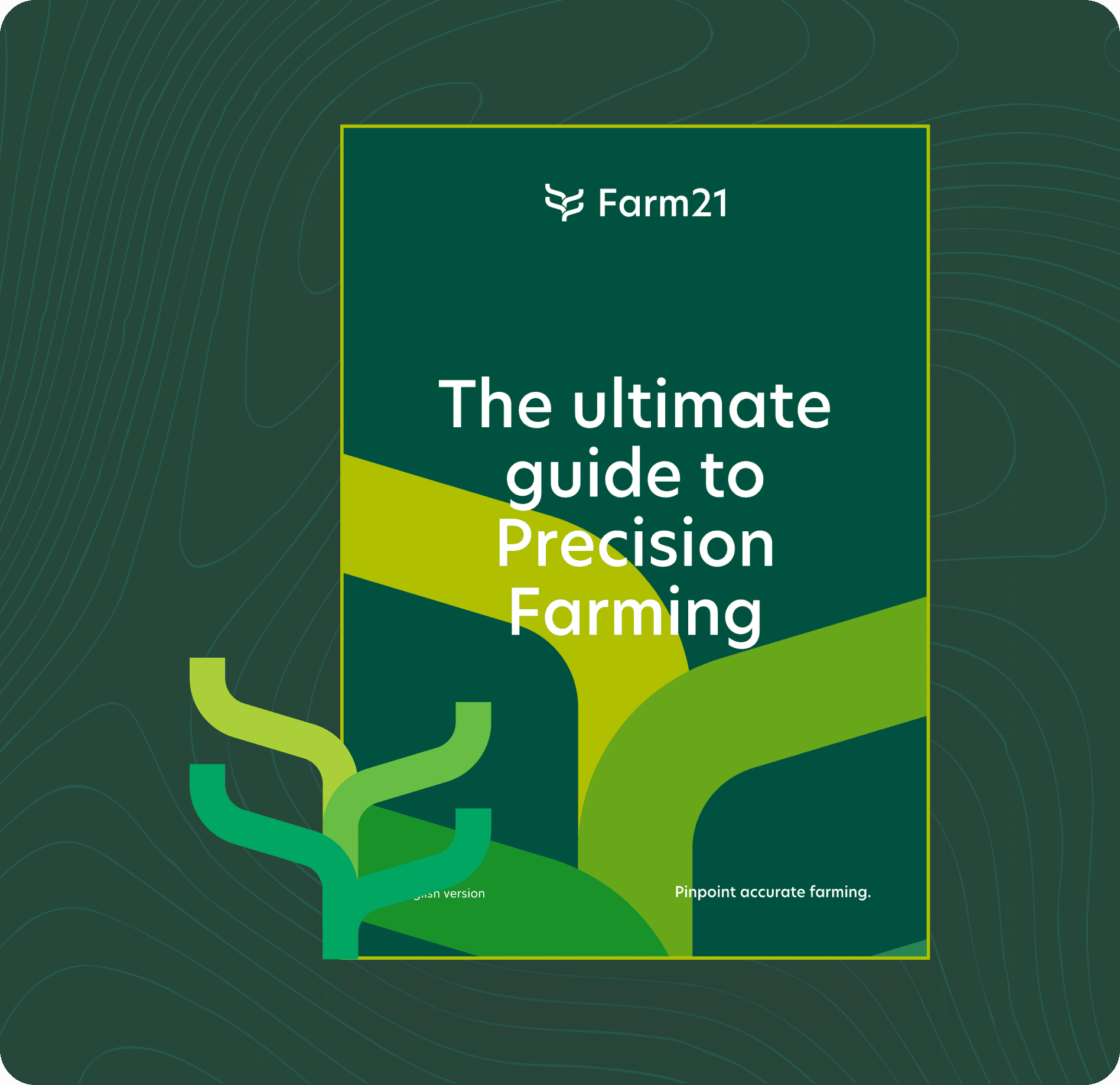
Refreshed brand identity and website for an AgriTech platform
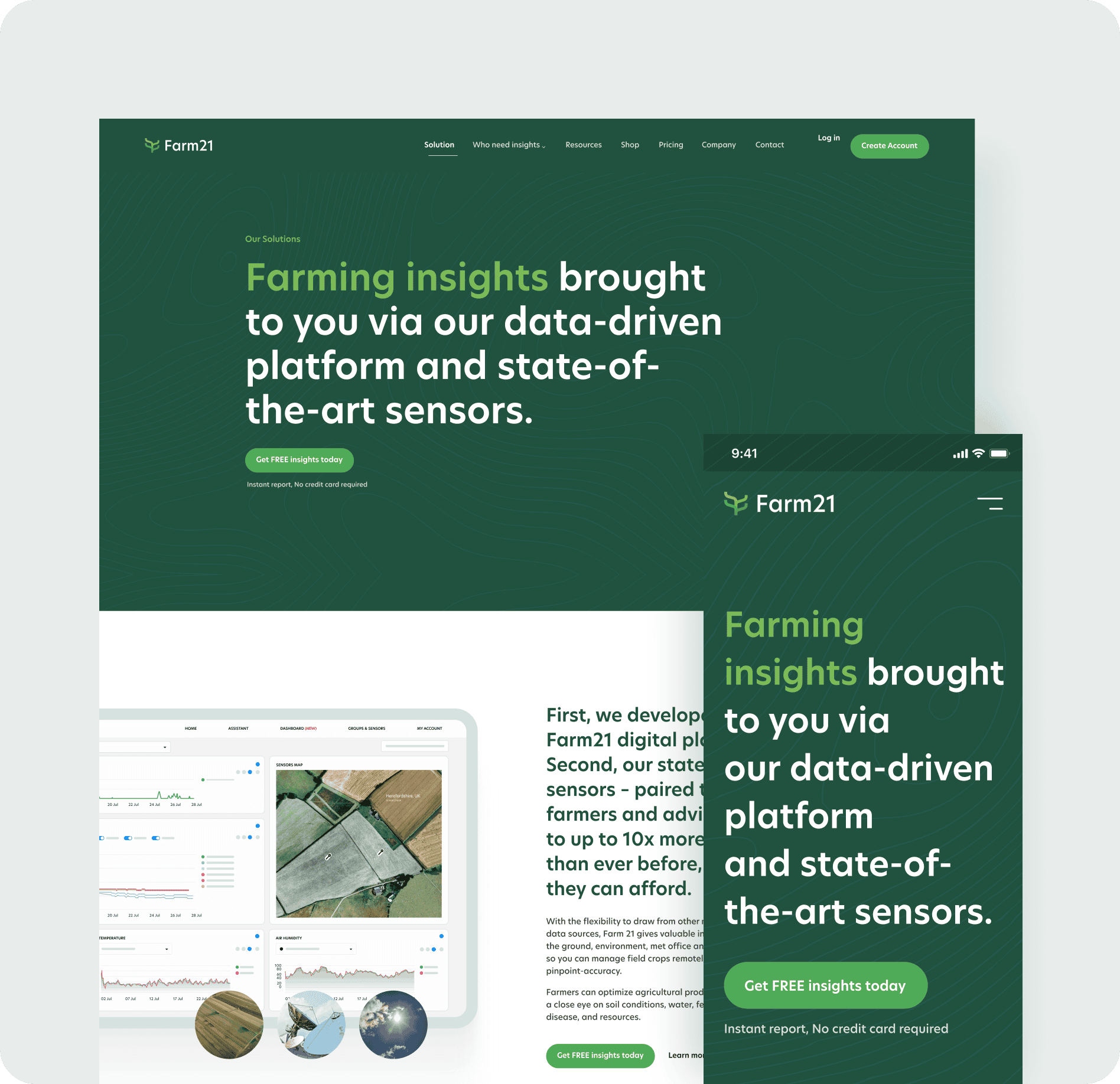
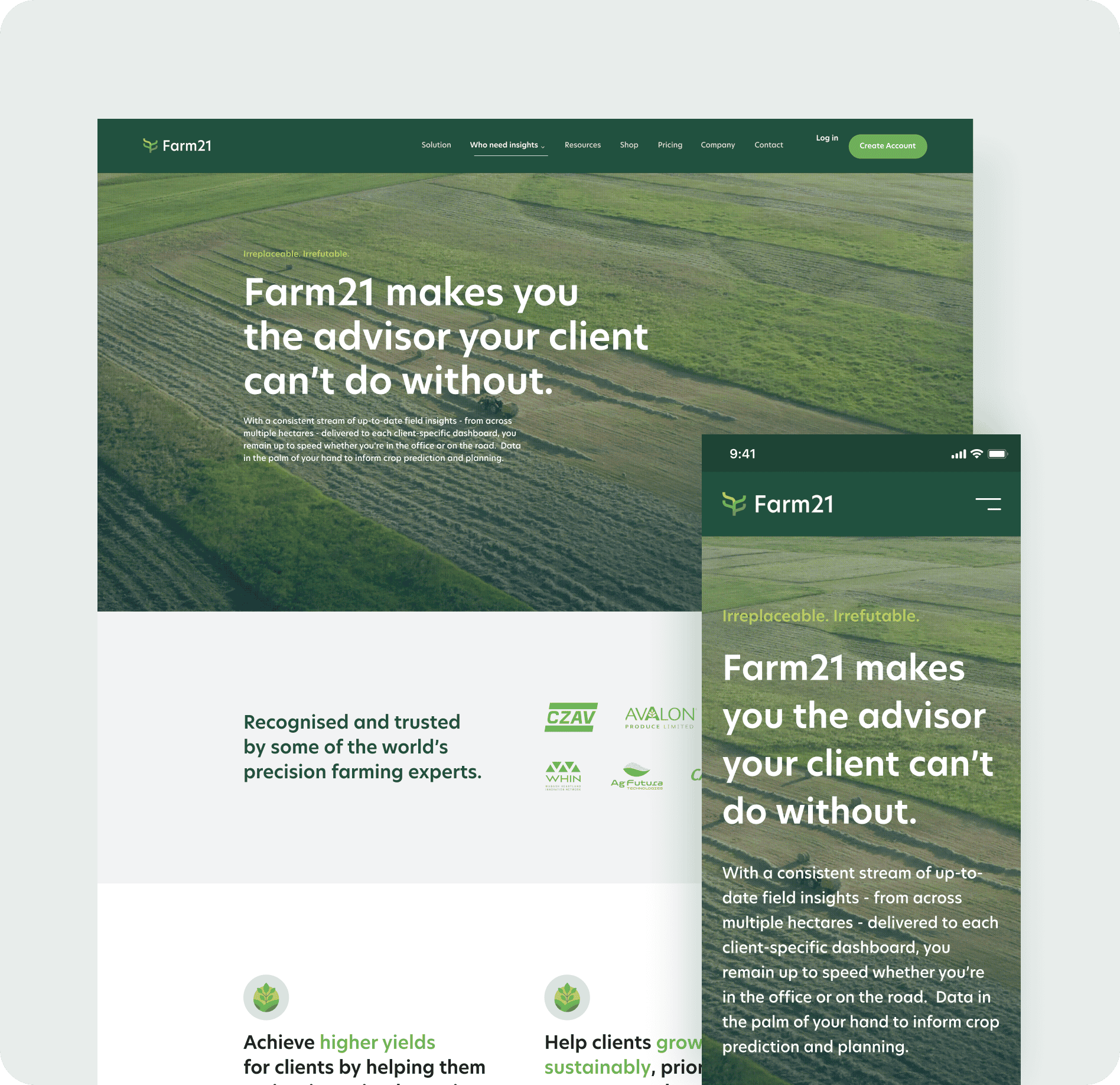
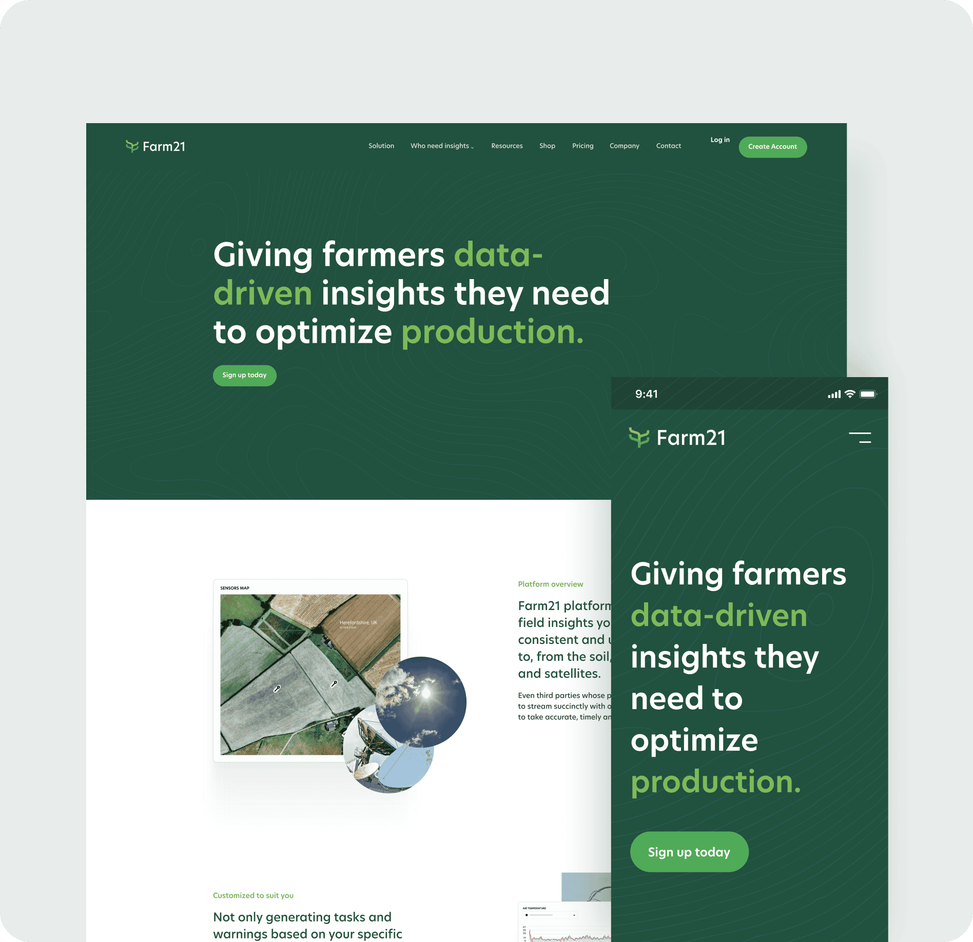
Farm21 gives farmers access to more data than ever before, providing pinpoint-accurate insights that combines data from proprietary low-cost sensors, weather, scouting, and satellites. Helping farmers, crop advisors and agricultural researchers to increase yields, save resources, grow more sustainable or validate trials.
As a seed-funded startup, Farm21 were looking to scale up their marketing efforts to acquire more customers.
Fundamental areas needed looking at to help achieve an elevated brand image that appeals to farmers, crop advisors and numerous other customer segments. Communication regarding the platform, sensors and offering was lost, and it was challenging for customers to interpret the solution. Additionally, the prior branding and website didn’t position Farm21 as a leader in the space.
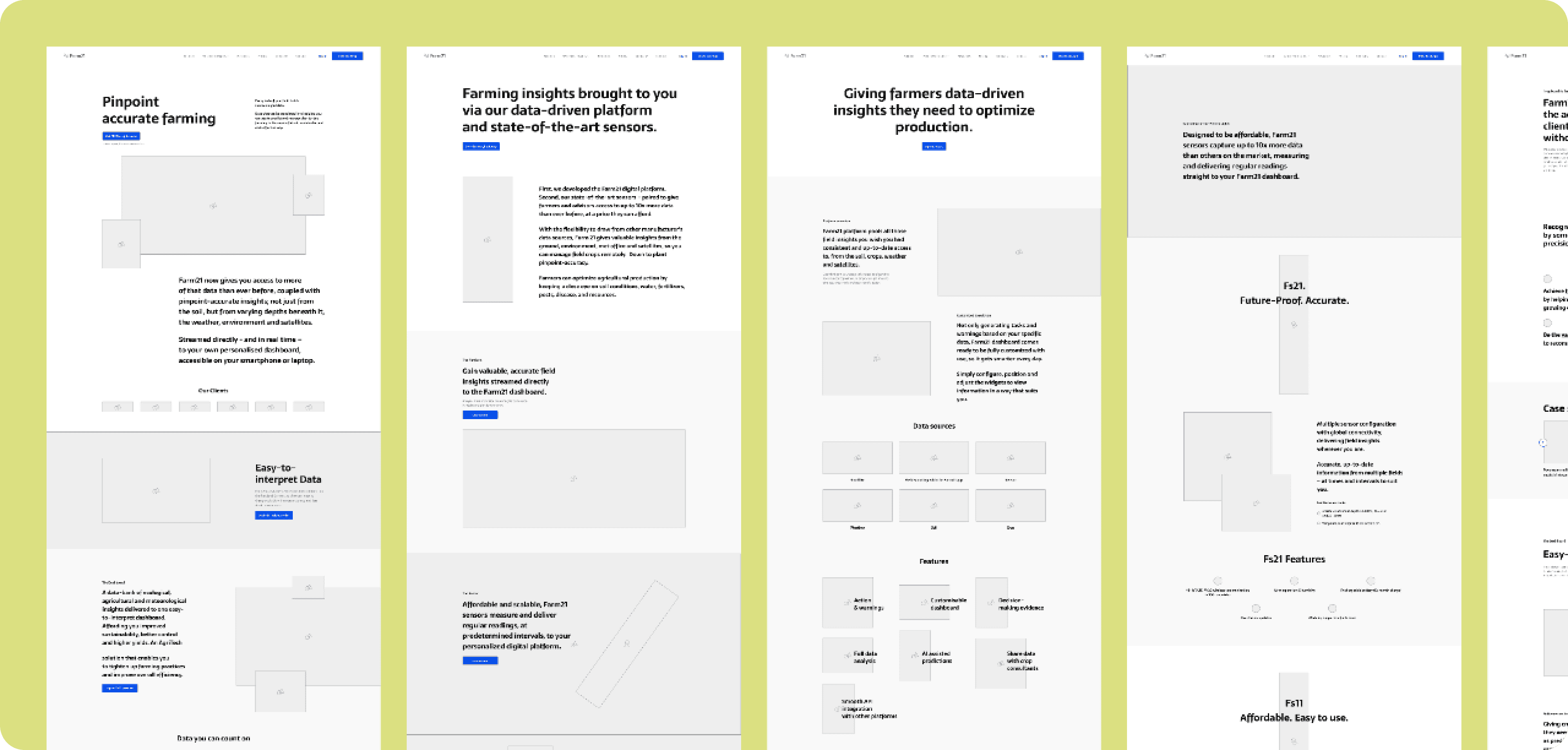
We took a holistic approach, starting from the brand identity and working outwards to the copywriting and website design.
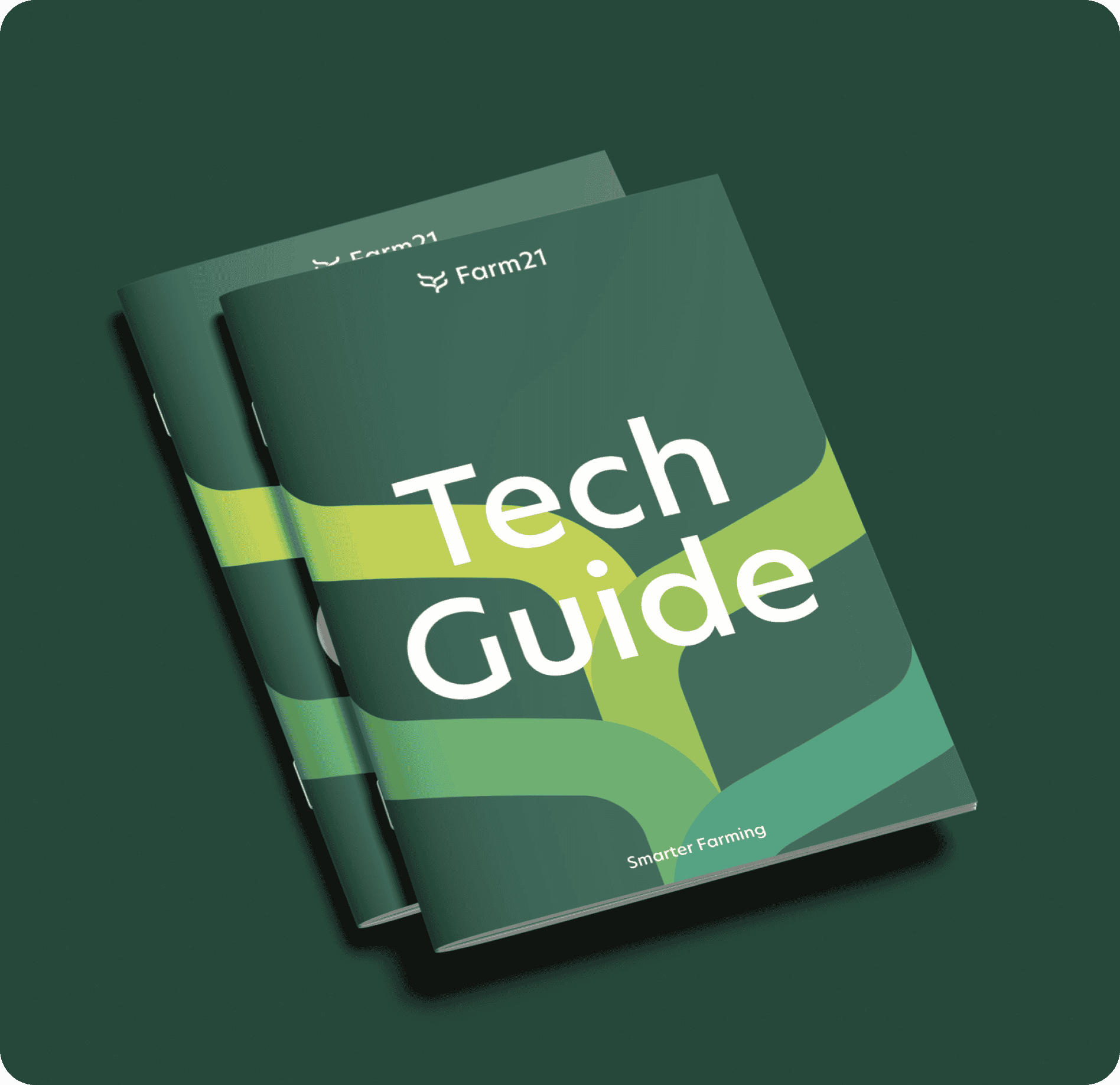
A full identity was established, covering multiple analogue and digital touchpoints where customers would come into contact with the brand.
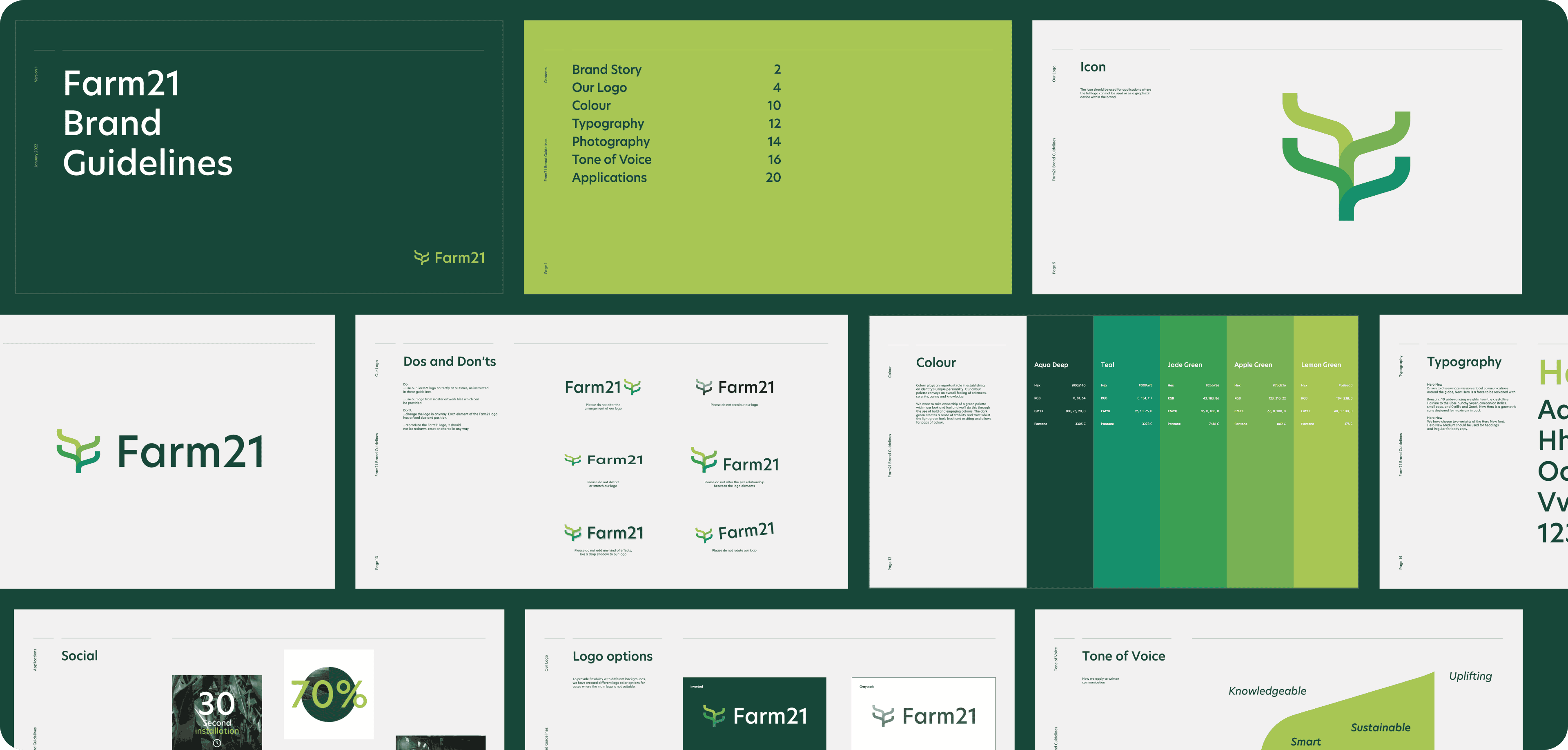
Following the strategy, we established three creative routes for the brand, and with some refinement, we narrowed it down to a single option reflected in the brand today.
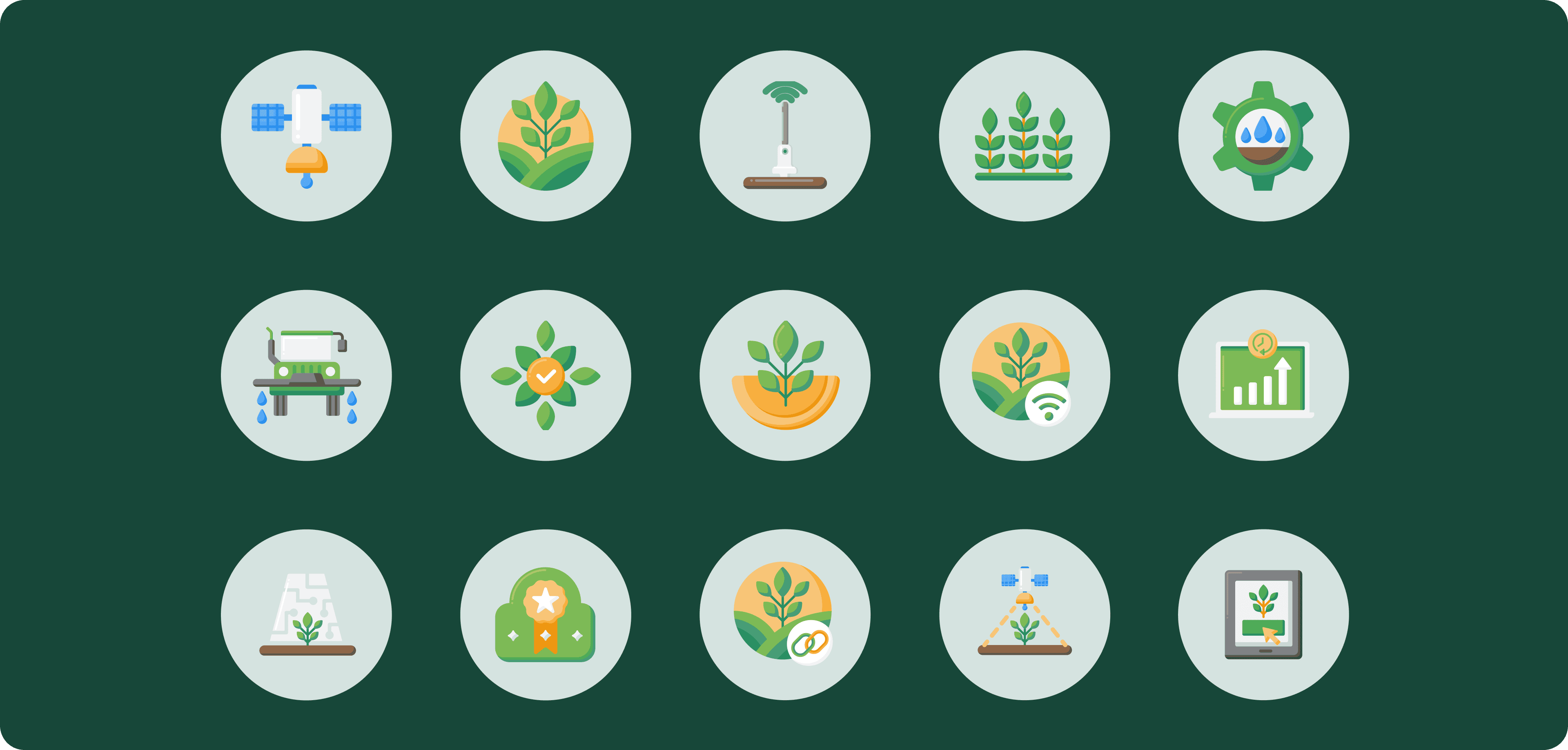
To ensure we had coherent visual language across icons, we created a set of icons for the website.
All centered around farming, crops and related activities. We used a filled approach to depict key messaging visually.
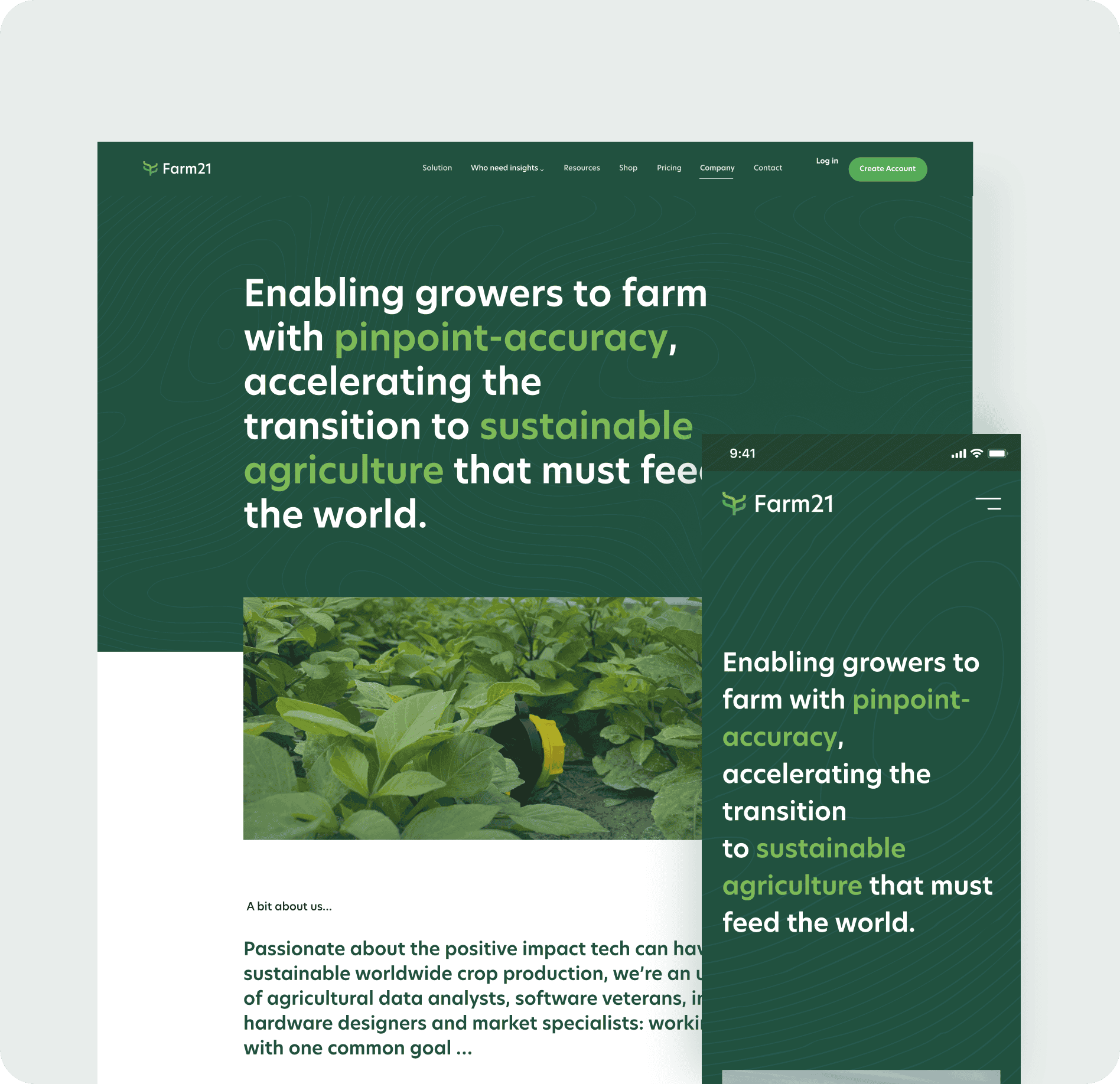
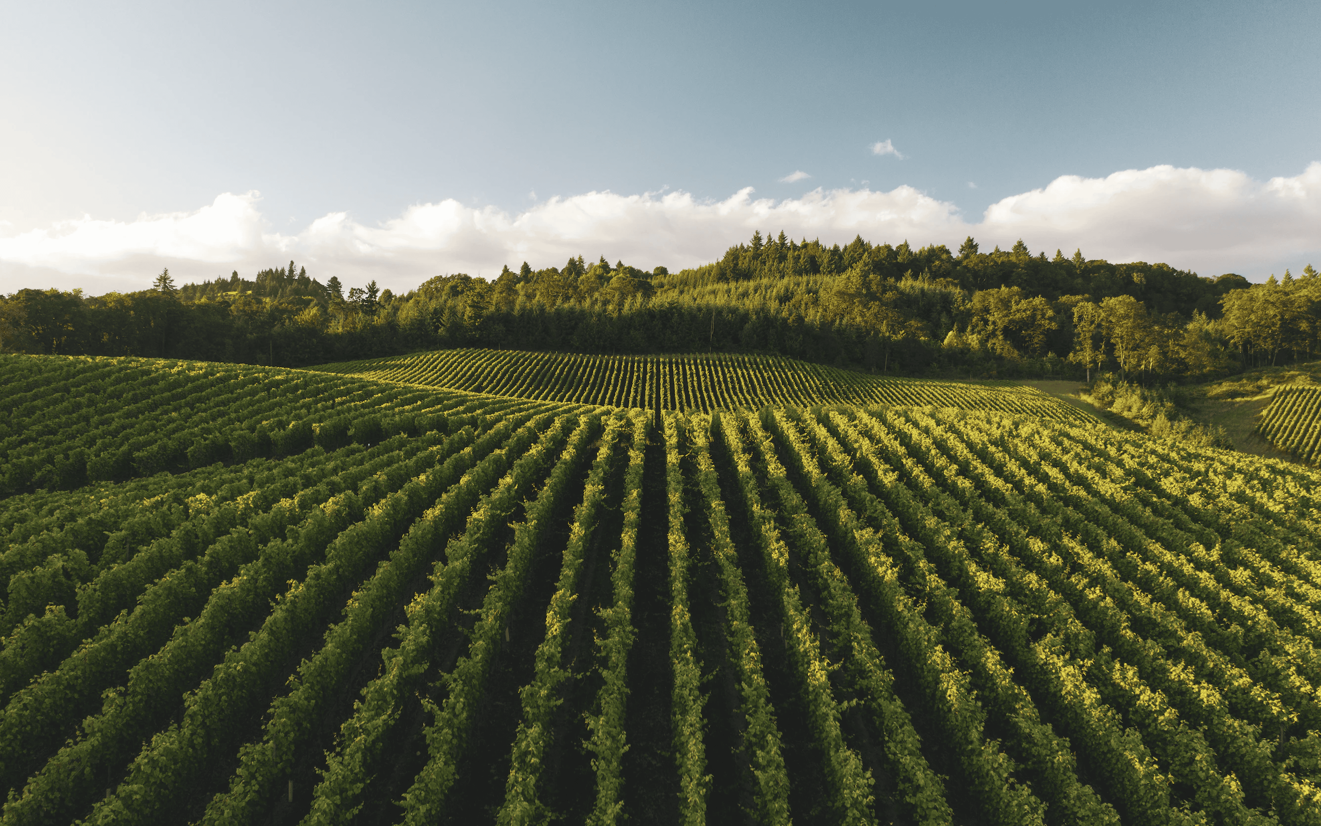
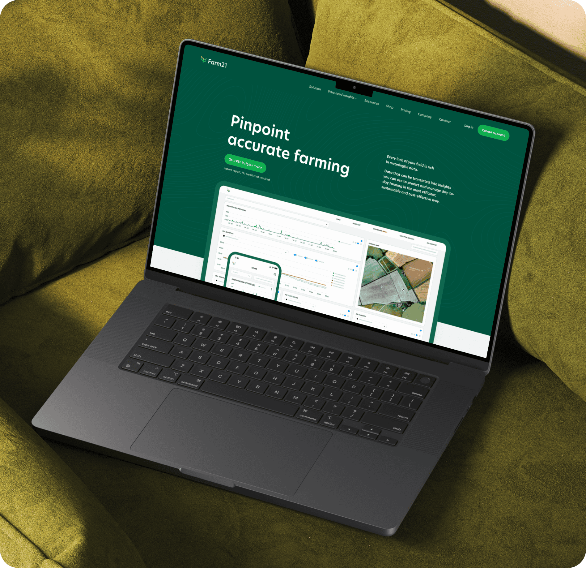
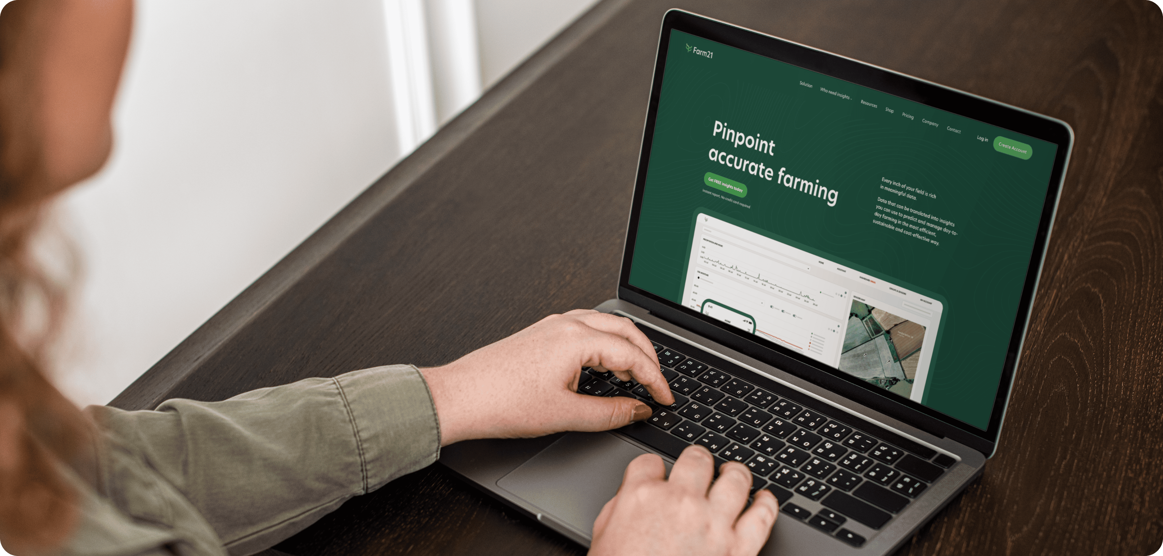
Sharp messaging paired with earthy visuals.
The visuals were tailored around the earthy feel of conveying fields where crops actively grow. We introduced a primary color of green which is predominant throughout the website and ties into the sustainability angle. Our copywriter wrote messaging to better convey the solution and value proposition to the market.
A Data-Driven, Sustainable, and User-Focused Digital Experience
The redesign of Farm21’s website was driven by a goal to seamlessly integrate precision farming insights with an engaging, earthy, and data-driven visual identity.